Multitimeframe Fair Value Gap – FVG (Zeiierman)█ Overview
The Multitimeframe Fair Value Gap – FVG (Zeiierman) indicator provides a dynamic and customizable visualization of institutional imbalances (Fair Value Gaps) across multiple timeframes. Built for traders who seek to analyze price inefficiencies, this tool helps highlight potential entry points, unmitigated gaps, and directional bias using smart volume logic and adaptive visual elements.
A Fair Value Gap (FVG) forms when there's a three-candle sequence in which a market imbalance leaves a "gap" between the wicks of candle 1 and candle 3. These areas are often considered footprints of institutional activity, and this indicator gives you the tools to track them with surgical precision across any timeframe you choose—regardless of the one you're viewing.
This indicator also includes a trend filter powered by a low-pass Butterworth filter, enabling traders to distinguish between countertrend vs. trend-aligned FVGs for more intelligent decision-making. On top of that, it features a dynamic FVG table for live tracking and bull/bear volume power visualization inside each gap, adding powerful clarity to market intent.
█ How It Works
The indicator analyzes the open, high, low, close, and volume of candles from a user-selected timeframe. It identifies Fair Value Gaps based on wick logic and only confirms those that meet customizable strength criteria. Once detected, the indicator visualizes each FVG with dynamically extending boxes, optional buy/sell volume bars, and a real-time mitigation check.
⚪ Multitimeframe Logic
Users can analyze FVGs from a higher or lower timeframe regardless of their current chart.
This is achieved using request.security() to fetch OHLCV data from the chosen timeframe.
⚪ Wick Sensitivity & Impulse Filter
The script measures the wick size of potential FVG candles and compares them to a running average. Only FVGs with wick sizes above a certain sensitivity threshold (user-controlled) are plotted. This ensures only meaningful price dislocations (e.g., strong impulsive moves) are shown, reducing noise.
⚪ Midpoint Mitigation Logic
FVGs are marked as "mitigated" when the price revisits the gap area. Traders can choose whether full gap closure or just a midpoint touch is required. This allows faster reactivity in real-time trading environments.
⚪ Bull & Bear Power – Volume-Weighted Visualization
Every Fair Value Gap box includes sub-bars representing the estimated buy and sell effort that created the gap. These are calculated using the candle's close in relation to its high/low range and volume:
Buy Volume % ≈ effort from low to close
Sell Volume % ≈ effort from high to close
Each sub-bar inside the FVG:
Is color-coded (UpCol for bullish, DnCol for bearish)
Is drawn proportionally to the strength of buyers or sellers
Visually displays who was in control during the imbalance
⚪ FVG Table – Dynamic On-Chart Overview
The indicator includes an optional on-chart table that displays all currently active (unmitigated) FVGs in a side panel format:
Automatic updates as gaps are formed and mitigated
Color-coded rows to show bullish vs. bearish FVGs
Timestamps to know precisely when the gap formed
User-controlled position via Table Left and Table Right
This is a gap watchlist overlay, giving traders a concise view of current inefficiencies without manually scanning the chart.
⚪ FVG Trend Filter (Butterworth Smoother)
Using a two-pole Butterworth low-pass filter, the indicator computes a trendline based on average FVG values, offering a smooth but responsive directional signal.
Passband Ripple (dB): Controls sensitivity and overshoot tolerance
Cutoff Frequency (0–0.5): Sets how quickly the trendline reacts
The trendline helps categorize each FVG:
Trend up → favor bullish FVGs
Trend down → favor bearish FVGs
It adds an extra dimension to FVG entries, helping distinguish between trend-aligned and countertrend signals.
█ How to Use
⚪ Identify Institutional Gaps
Use this tool to identify areas where institutions may have left imbalances behind quickly.
These areas often become:
Strong support/resistance zones
Areas where price might react sharply
Targets for liquidity sweeps or retracements
⚪ React to Trend or Countertrend
The built-in trendline helps categorize each FVG:
Trend up → Bullish FVGs have higher validity
Trend down → Bearish FVGs have higher validity
⚪ Volume Context via Bull/Bear Power
Each Fair Value Gap is more than just a price imbalance — it’s a story of effort and intent. The Bull/Bear Power feature visualizes the buy and sell pressure behind each FVG, helping you understand how the gap was formed and who was in control.
A bullish FVG with a strong buy effort suggests continuation potential — buyers dominated the move.
A bullish FVG with a dominant sell effort could signal a trap or reversal — sellers may have overwhelmed the breakout.
These insights allow you to confirm imbalance strength, spot traps early, and add confidence to entries based on dominant volume profiles.
Instead of viewing gaps as static zones, this feature turns each into a live volume map — a visual breakdown of who moved the market and whether that move had conviction.
⚪ Plan with the FVG Table
The FVG Table acts as your on-chart control center for tracking active imbalances. When enabled, it provides a clear summary of all unmitigated Fair Value Gaps, helping you stay organized and focused during fast-moving sessions.
Track live and historical gaps: See exactly when and where each FVG formed.
Monitor older, still-valid zones: Gaps off-screen but not mitigated remain in play — perfect for anticipating future reactions.
Gauge market bias at a glance: The balance of bullish vs. bearish FVGs helps you understand overall directional pressure.
Plan entries confidently: Use the table to reference all zones for risk management, confluence stacking, or layered execution strategies.
Instead of manually scanning your chart, the FVG Table offers a clean, at-a-glance overview of the market’s inefficiencies — giving you the structure needed to act with precision.
█ Settings
FVG Timeframe
Select any timeframe to source FVGs independent of your current chart.
Sensitivity
Filter FVGs by how impulsive the move is — it helps you eliminate weak gaps.
Mitigated on Mid
Control whether gaps are removed at midpoint touch or full fill.
Table Settings
Control the table position and width. Cleanly view all active FVGs.
FVG Style
Customize gap box colors, length, and bullish/bearish overlays.
Trend Filter
Enable or disable the smoothed FVG-based trendline with customizable smoothing controls.
-----------------
Disclaimer
The content provided in my scripts, indicators, ideas, algorithms, and systems is for educational and informational purposes only. It does not constitute financial advice, investment recommendations, or a solicitation to buy or sell any financial instruments. I will not accept liability for any loss or damage, including without limitation any loss of profit, which may arise directly or indirectly from the use of or reliance on such information.
All investments involve risk, and the past performance of a security, industry, sector, market, financial product, trading strategy, backtest, or individual's trading does not guarantee future results or returns. Investors are fully responsible for any investment decisions they make. Such decisions should be based solely on an evaluation of their financial circumstances, investment objectives, risk tolerance, and liquidity needs.
In den Scripts nach "volume profile" suchen

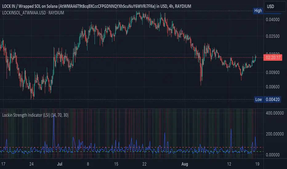
Lockin Strength Indicator (LSI)How It Works:
RSI Calculation: The standard RSI is calculated using a 14-period by default.
Volume Weighting: If enabled, the LSI modifies the RSI by weighting it based on the volume relative to its moving average. This emphasizes periods of high or low volume, which can be particularly useful for Solana-based assets that might have unique volume profiles.
Plotting: The LSI is plotted with standard overbought and oversold levels, and background highlighting makes these areas visually distinct.
Customization:
RSI Length: You can adjust the length of the RSI period.
Overbought/Oversold Levels: You can modify the levels for overbought and oversold signals.
Volume Weighting: You can toggle volume weighting on or off.
This indicator is designed to give you a more nuanced view of Solana cryptocurrencies by combining RSI with volume dynamics.
Volume Forks [Trendoscope]🎲 Volume Forks - Advanced Price Analysis with Recursive Auto-Pitchfork and Angled Volume Profile
The Volume Forks Indicator is a comprehensive research tool that combines two innovative techniques, Recursive Auto-Pitchfork and Angled Volume Profile . This indicator provides traders with valuable insights into price dynamics by integrating accurate pitchfork drawing and volume analysis over angled levels. The indicator does following things
Detects Pitchfork formations automatically on the chart over Recursive Zigzag
Instead of drawing forks based on fib levels, volume distribution over ABC of pitchfork is calculated and drawn in the direction of the handle.
🎲 Brief about Pitchfork
Pitchfork is drawn when price forms ABC pattern. Pitchfork draws a series of parallel lines in the direction of trend which can be used for support and resistance.
There are many methods of drawing pitchfork. In all cases, a line joining BC will make the base of pitchfork and fork lines are drawn from different points of the base. All the fork lines will be parallel. But, the handle of the base defines the direction of fork lines. Classification of pitchfork is mainly based on the starting and ending points of the handle.
🎲 Regular Types
Here, end of the handle is always fixed and it will be the mid point of B and C.
🎯 Andrews Pitchfork
Handle starts from A and joins the base at mid of B and C.
Forks are drawn based on fib ratios from the handle
🎯 Schiff Pitchfork
Handle starts from Bar of A and price of middle of AB and joins the base at mid of B and C
Forks are drawn based on fib ratios from the handle
🎯 Modified Schiff Pitchfork
Handle starts from mid of A and B and joins the base at mid of B and C
Forks are drawn based on fib ratios from the handle
🎲 Inside Types
Here, C will act as end of the handle which joins the Base BC .
🎯 Andrews Pitchfork (Inside)
Handle starts from A and joins the base at C
Forks are drawn based on fib ratios from the handle
🎯 Schiff Pitchfork (Inside)
Handle starts from Bar of A and price of (A+B)/2 and joins the base at C
Forks are drawn based on fib ratios from the handle
🎯 Modified Schiff Pitchfork (Inside)
Handle starts from mid of A and B and joins the base at C
Forks are drawn based on fib ratios from the handle
🎲 Brief about Pitchfork
The Angled Volume Profile technique expands on the concept of volume profile by measuring volume distribution levels over angled levels rather than just horizontal levels. By selecting a starting point and angle interactively, traders can assess volume distribution within specific price trends. This feature is particularly useful for analysing volume dynamics in trending markets.
🎲 Settings
Indicator settings include few things which determine the scanning of pitchforks and few which determines drawing of volume profile lines.
Please note that, due to pine limitations of 500 lines, if there are too many formations on the chart, volume profile may not appear correctly. If that happens, please reduce the number of volume forks per formation.

High Volume Footprint BreakoutThe High Volume Footprint Breakout indicator brings institutional-grade Order Flow analysis to your standard TradingView charts. By looking inside the candles using intrabar data, this tool identifies specific price levels where massive, aggressive buying or selling volume has occurred.
Unlike standard Volume Profiles which show volume over a long period, this indicator isolates specific moments of high-intensity participation. It draws extended support and resistance lines from these "High Volume Nodes," helping you identify where institutions have stepped in and where trapped traders might exist.
Why Use This Indicator?
Standard candlestick charts show you where price went, but they hide how it got there. A candle might look normal, but inside that candle, there could be a massive battle between buyers and sellers at a specific price level.
Reveal Hidden Liquidity : Find the exact price levels that defended a move.
Filter the Noise : Instead of showing every volume node, this script only highlights Breakout Levels —areas where the single-price volume exceeded a historical maximum (e.g., the highest volume node in the last 20 bars).
No External Tools Needed : Replicates the logic of professional Footprint/Order Flow software using native TradingView data.
How It Works (The Logic)
This script uses a strict algorithm to reconstruct a virtual "Footprint" of the market:
Intrabar Analysis : It accesses lower timeframe data (e.g., 1-minute data inside a Daily bar) to analyze price action at a granular level.
Volume Categorization : It separates volume into Buy Volume (Aggressive Buyers) and Sell Volume (Aggressive Sellers) based on price movement logic.
Volume Distribution : To ensure accuracy, it distributes the volume of intrabar candles across their High-Low range, preventing artificial volume spikes on single ticks.
Breakout Detection : It compares the highest volume node of the current bar against the highest nodes of the previous X bars. If the current volume is a new local record, a line is drawn.
How to Trade This Indicator
1. The Standard Rejection (Trend Continuation)
Green Lines (Aggressive Buyers) : These levels represent areas where buyers stepped in with massive force. In an uptrend, expect price to bounce off these lines. Treat them as Support.
Red Lines (Aggressive Sellers) : These levels represent areas where sellers unloaded heavy positions. In a downtrend, expect price to reject these lines. Treat them as Resistance.
2. The "Flip" Setup (Trapped Traders)
This is an advanced Order Flow concept. When the market disrespects a high-volume level, it creates "Trapped Traders."
Red Line Acting as Support : If price breaks above a Red (Sell) line and holds, the aggressive sellers at that level are now trapped underwater. When price returns to this line, these sellers often buy to close their positions at breakeven, fueling a bounce.
Green Line Acting as Resistance : If price breaks below a Green (Buy) line, the aggressive buyers are trapped. When price rallies back to this line, they often sell to exit, creating resistance.
Settings & Configuration
Auto-Select Intrabar Timeframe :
Enabled (Recommended) : Automatically selects the best resolution (1-min for Intraday/Daily, 60-min for Weekly/Monthly) to match the "Volume Data Source" standards.
Disabled : Allows you to manually force a specific intrabar resolution.
Breakout Lookback Period : Determines how significant a volume spike must be to trigger a line. (Default: 20). Higher values = fewer, stronger lines.
Max Visible Lines : Limits the number of lines on the chart to keep your workspace clean.
Label Offset : Adjusts how far to the right the text labels appear, allowing you to position them perfectly for your screen setup.
Who Should Use This?
Order Flow Traders : Who want footprint-style logic without complex grid charts.
Price Action Traders : Who want objective, data-driven Support & Resistance levels rather than subjective drawings.
Scalpers & Day Traders : Who need to see where the "heavy hands" are transacting in real-time.
Disclaimer & Limitations
Intrabar vs. Tick Data : This script uses TradingView's intrabar data to approximate the footprint. While highly accurate, it may differ slightly from tick-perfect software.
Volume Data Required : This indicator requires the asset to provide real volume data. It works best on Futures, Crypto, and Stocks. It may not work on FOREX pairs that do not provide tick volume.
Does it Repaint?
Short Answer:
No , it does not repaint on closed bars. Once a candle closes and a line is drawn, that line is permanent and will not move or disappear.
Long Answer (The Nuances):
There are two specific scenarios you need to be aware of regarding how TradingView handles data:
1. The "Forming Bar" (Wait for Close)
Behavior : While the current candle is still moving (open), the indicator is calculating the volume in real-time. If a massive volume spike happens right now, a line might appear. If the volume of previous bars suddenly looks smaller by comparison, the condition might change.
Solution : Like almost all indicators, you must wait for the bar to close to confirm the signal. Once the bar closes, the calculation is locked and the line is fixed forever.
2. Historical Data Limits (The "Disappearing History" Issue)
Behavior : This script relies on request.security_lower_tf (e.g., fetching 1-minute data inside a Daily bar). TradingView does not store infinite 1-minute data for every asset. They usually store a few thousand bars of lower timeframe history (more if you have a Premium account).
The Issue : If you scroll back 5 years on a Daily chart, the script will try to fetch the 1-minute data for a day in 2019. If TradingView has deleted that old 1-minute data to save space, the script will receive "empty" data.
Result : You might see lines on the recent chart (last few months/year), but if you scroll back too far, the lines will stop appearing because the underlying data doesn't exist anymore.
Is this Repainting? Technically, no. It's a Data Availability limitation. But it means that what you see on a chart from 5 years ago might look different than what you saw when you were trading it live 5 years ago.
Disclaimer
For Educational and Informational Purposes Only
This indicator is provided for educational and informational purposes only and DOES NOT constitute financial, investment, or trading advice. The "High Volume Footprint Breakout" tool is based on historical data analysis and algorithmic interpretation of market volume; it does not predict future market movements with certainty.
Risk Warning
Trading in financial markets (Stocks, Crypto, Futures, Forex, etc.) involves a high degree of risk and may not be suitable for all investors. You could lose some or all of your initial investment. Past performance of any trading system or methodology is not necessarily indicative of future results.
No Liability
The author of this script assumes no responsibility or liability for any errors or omissions in the content of this indicator, or for any trading losses or damages incurred as a result of using this tool. Users are solely responsible for their own trading decisions and should always use proper risk management. By using this script, you acknowledge and agree to these terms.

VRVP Clone + Multi-POC -- PerroGordoVRVP Clone + Multi-POC
Overview
VRVP Clone + Multi-POC replicates TradingView's native Visible Range Volume Profile with several practical enhancements. The indicator displays volume distribution across price levels for the visible chart range, which is useful for identifying high-volume nodes, support/resistance zones, and areas of price acceptance.
The main differentiator from the built-in VRVP is support for multiple Point of Control (POC) lines with an intelligent peak detection algorithm. Instead of just showing the single highest-volume level, you can identify distinct volume clusters across different price zones.
Features
Dynamic Visible Range
Recalculates automatically on scroll or zoom
Analyzes only visible bars
Profile width scales proportionally to view
Multiple POC Detection (1-8 levels)
Volume Nodes Mode: Peak detection algorithm finds local volume maxima across distinct price clusters
Highest Rows Mode: Traditional approach - top N rows by raw volume
Configurable minimum separation between nodes to prevent bunching
Individual colors for each POC level
Volume Display Modes
Up/Down: Split bars showing buy vs. sell volume with black outlines for visual separation
Total: Single bar colored by dominant direction
Delta: Net volume (buy minus sell)
Delta Intensity: Gradient coloring indicating buyer/seller dominance strength per row
Value Area
Configurable percentage (default 70%)
VAH and VAL lines with customizable styles
Separate colors for volume inside vs. outside the Value Area
Positioning Options
Left or Right placement
Adjustable profile width as percentage of visible range
Row configuration via "Number of Rows" or "Ticks Per Row"
Additional Features
Statistics table showing bars analyzed, total volume, up/down percentages, price vs POC
POC price labels on chart
Line style options (Solid, Dashed, Dotted)
+++++
How It Works
Volume from each bar is distributed across price rows based on the bar's high-low range. The allocation is proportional - if a bar spans 3 rows with 60% overlap on one row, that row receives 60% of the bar's volume.
Volume Nodes Mode identifies local peaks in the distribution (rows where volume exceeds both neighbors), then selects the highest peaks while enforcing minimum separation. This surfaces distinct support/resistance clusters rather than stacking all POC lines in a single high-volume area.
+++++
Settings
Inputs
Setting - Description
Rows Layout - "Number of Rows" or "Ticks Per Row"
Row Size - Number of rows (24-200) or ticks per row
Volume - "Up/Down", "Total", "Delta", or source selection
Value Area % - Percentage of volume for Value Area (default 70%)
Profile Width % - Width as percentage of visible bars
Placement - "Right" or "Left" side of chart
Enhancements
Setting - Description
Number of POCs | 1-8 POC lines |
POC Mode - "Volume Nodes" (peak detection) or "Highest Rows" (traditional)
Min Node Separation - Minimum rows between nodes (0 = auto-calculate)
Delta Intensity Mode - Gradient coloring by dominance
Show Stats Table - Display analysis statistics
Style
Setting - Description
Up/Down Volume Colors - Buy/sell volume colors
Value Area Colors - Colors for VA regions
POC/VAH/VAL Colors - Line colors and styles
POC 2-8 Colors - Colors for additional POC levels
+++++
Applications
Support/Resistance Identification
High-volume nodes tend to act as price magnets. Multiple POCs reveal layered S/R zones that aren't visible with a single POC.
Fair Value Reference
The Value Area represents where 70% of volume traded. Price tends to revert to this zone.
Volume Gap Analysis
Low-volume areas between POCs indicate prices that were rejected quickly - potential breakout or breakdown levels.
Market Structure
Multiple POCs across price levels show where the market has found acceptance, useful for distinguishing range-bound conditions from trending moves.
+++++
Practical Notes
Volume Nodes mode with 3-5 POCs works well for identifying distinct S/R clusters
Higher row counts give more granular analysis on lower timeframes
Delta Intensity mode quickly shows buyer/seller dominance at each level without the visual noise of split bars
If POCs are too clustered, increase Min Node Separation; if too spread out, decrease it or set to 0 for auto
The stats table vs POC comparison is useful for quick directional bias assessment
+++++
Requirements
Any instrument with volume data
Works well on futures, forex, and liquid equities
Pine Script v6
+++++
Version History
v1.1
- Added Volume Nodes mode with peak detection
- Expanded to 8 POC levels
- Added Min Node Separation setting
- Fixed POC label positioning for left placement
- Added black outlines to Up/Down volume bars
v1.0
- Initial release replicating VRVP with multi-POC enhancement
- Delta Intensity mode
- Statistics table

Cryptocurrency Advanced Sentiment Indicator v6.0 Cryptocurrency Advanced Sentiment Indicator v6.0 + Abnormal Volume Detection
🌟 ORIGINAL CONTRIBUTION & UNIQUE FEATURES
This is not just another sentiment indicator - it's a multi-dimensional market intelligence system that combines 16 distinct analytical methodologies into a unified framework. What makes this script truly original is its:
Hybrid Sentiment Engine: Unlike conventional indicators that rely on single metrics (like RSI or MACD alone), this system calculates sentiment from 11 simultaneous dimensions, each weighted according to market impact.
Proprietary Top/Bottom Detection Algorithm: Instead of basic overbought/oversold signals, it employs a multi-confirmation escape top/bottom system that requires alignment across price, volume, whale activity, divergence patterns, and market breadth.
Advanced Volume Analytics: Beyond simple volume spikes, it implements three-tier volume analysis:
Abnormal Volume Detection (statistical percentile-based)
Volume Profile Analysis (value area positioning)
Whale Activity Recognition (institutional footprint identification)
Gap Intelligence System: A comprehensive gap analysis that doesn't just identify gaps but:
Classifies them by size and significance
Tracks fill status with dynamic thresholds
Correlates gap events with volume anomalies
Market Microstructure Simulation: Despite TradingView's API limitations, the script simulates order flow analysis and market profile concepts using available price/volume data.
🔍 WHAT IT DOES & HOW IT WORKS
CORE FUNCTIONALITY
This script functions as a complete market state analyzer that:
Quantifies Market Sentiment on a -100 to +100 scale through weighted aggregation of:
Technical Indicators (RSI, MACD, Bollinger Bands, ADX)
Volume Dynamics (abnormal volume, volume trends, cluster analysis)
Price Structure (support/resistance proximity, pattern recognition)
Market Internals (breadth, velocity, acceleration)
Behavioral Metrics (simulated fear/greed, whale tracking)
Detects Critical Market Events including:
Sentiment Extremes (overheat/oversold conditions)
Institutional Activity (whale accumulation/distribution)
Gap Events (breakaway/runaway/exhaustion gaps)
Volume Anomalies (statistical outliers in trading activity)
Generates Actionable Signals across multiple timeframes:
Trend Identification (EMA alignment with volume confirmation)
Reversal Anticipation (multi-indicator divergence detection)
Breakout Confirmation (price + volume + sentiment convergence)
Risk Assessment (volatility-adjusted position sizing guidance)
IMPLEMENTATION METHODOLOGY
The system operates through five analytical layers:
Layer 1: Data Collection & Normalization
Multi-timeframe EMA analysis (current + 1-hour confirmation)
Volume normalization across 20/50/100 period moving averages
Price position calculation relative to key historical levels
Layer 2: Indicator Synthesis
Weighted Composite Scoring: Each of 11 sentiment dimensions contributes 5-15% to the final score
Dynamic Adjustments: Top detection signals can override bullish/bearish bias when extreme conditions are detected
Smoothing Algorithms: Exponential and simple moving averages prevent whipsaw signals
Layer 3: Pattern Recognition
Candlestick Pattern Detection: Engulfing patterns, hammers, hanging men
Divergence Identification: Price/RSI and price/MACD misalignment
Volume Pattern Analysis: Clustering, spike sequences, distribution curves
Layer 4: Statistical Analysis
Percentile Ranking: Volume compared to 50-period lookback
Standard Deviation Analysis: Bollinger Band positioning and squeeze detection
Regression Trends: Volume and price momentum slope calculations
Layer 5: Signal Generation
Multi-condition Triggers: Signals require 3-5 confirming conditions
Confidence Scoring: Each signal includes a 0-100% confidence metric
Hierarchical Prioritization: Escape top/bottom signals override standard buy/sell recommendations
🎯 PRACTICAL USAGE & APPLICATION
FOR TREND FOLLOWERS
This isn't basic trend following. It implements multi-timeframe trend confirmation specifically:
EMA Ribbon Analysis with volume-weighted confirmation
ADX-filtered Trends that ignore movements below 20 ADX
Velocity-accelerated Trends that identify strengthening/weakening momentum
Breadth-confirmed Trends requiring multiple indicator alignment
FOR MEAN REVERSION TRADERS
The system employs three distinct mean reversion methodologies:
Statistical Mean Reversion: Bollinger Band positioning with RSI confirmation
Sentiment Extreme Reversion: Composite sentiment at ±70+ levels with divergence
Volume-driven Reversion: Abnormal volume at key support/resistance levels
FOR BREAKOUT TRADERS
Breakout signals require triple confirmation:
Price Break above/below 20-period high/low
Volume Expansion > 2x average
Sentiment Alignment >20/-20 sentiment score
FOR INSTITUTIONAL FLOW TRACKERS
Unique whale detection using volume-profile analysis:
Accumulation Patterns: Rising price with increasing volume in middle RSI range
Distribution Patterns: Falling price with increasing volume in middle RSI range
Huge Volume Trades: 5x+ average volume at price extremes
🧠 UNDERLYING PHILOSOPHY & LOGICAL FRAMEWORK
CORE MARKET HYPOTHESES
The Multi-dimensional Market Hypothesis: No single indicator reliably predicts price movement; only the convergence of multiple independent analytical approaches creates edge.
The Volume-Price-Sentiment Trinity: Sustainable moves require alignment between trading volume, price action, and market sentiment. Divergence among these three suggests weak or reversing moves.
The Institutional Footprint Principle: Large players leave identifiable patterns in volume and price behavior that can be systematically detected.
The Sentiment Cycle Theory: Markets move through predictable sentiment cycles from extreme pessimism to extreme optimism, with identifiable transition points.
ALGORITHMIC FOUNDATIONS
The Composite Sentiment Index weights:
15% Whale Activity & Institutional Flow
10% RSI & Momentum Alignment
10% MACD & Trend Structure
10% Fear/Greed & Market Psychology
8% Volume Dynamics & Anomalies
8% Order Flow Simulation
8% Price Pattern Recognition
7% Support/Resistance Positioning
6% Market Profile Analysis
5% Bollinger Band Positioning
13% Distributed among specialized algorithms (gap, top detection, velocity, etc.)
The Escape Top/Bottom Algorithm requires five of seven confirmations:
Market Overheat/Oversold Score > 70%
Price Divergence (RSI + MACD)
Volume Anomaly Detection
Whale Activity Confirmation
Technical Indicator Alignment
Money Flow Direction
Pattern Recognition
📊 VISUAL INTERFACE & INTERPRETATION
COLOR-CODED MARKET STATES
Red (75-100): Extreme Optimism - Consider taking profits
Orange (50-75): Optimistic - Monitor for divergence
Yellow (25-50): Neutral Bullish - Trend continuation likely
Light Green (0-25): Slightly Bullish - Consider entry on pullbacks
Light Blue (-25-0): Slightly Bearish - Consider short on rallies
Blue (-50--25): Bearish - Downtrend established
Purple (-75--50): Pessimistic - Monitor for capitulation
Dark Purple (-100--75): Extreme Pessimism - Consider accumulation
KEY SIGNAL HIERARCHY
🏃♂️ Escape Top / 💰 Bottom Pick Signals (Highest priority - multi-confirmation)
🎯 Strong Buy/Sell Signals (Multiple indicator alignment)
📈 Abnormal Volume Signals (Statistical volume extremes)
🔼 Gap Signals (Breakaway/runaway gaps)
📊 Trend Start/Reversal Signals (EMA/volume/sentiment alignment)
DATA PANELS PROVIDED
Main Dashboard: Current price, sentiment, RSI, volume status, trends
Advanced Analysis: Momentum, volatility, order flow, multi-timeframe confirmation
Signal Summary: Active trading signals with confidence levels
Risk Assessment: Volatility, money flow, key level distances
⚙️ CUSTOMIZATION & PARAMETER ADJUSTMENT
ESSENTIAL SETTINGS FOR DIFFERENT STYLES
For Day Traders:
Reduce sentiment smoothing to 1-2 periods
Enable all signal types
Set abnormal volume threshold to 2.5-3.0x
Enable gap detection with 0.5-1.0% threshold
For Swing Traders:
Increase sentiment smoothing to 3-5 periods
Focus on escape top/bottom and abnormal volume signals
Set key level period to 50-100
Enable volume confirmation for all signals
For Position Traders:
Maximum smoothing (5-10 periods)
Primary focus on top detection and whale activity
Increase huge volume threshold to 6.0-8.0x
Enable all advanced algorithms
⚠️ RISK CONSIDERATIONS & LIMITATIONS
INHERENT LIMITATIONS
Historical Analysis Only: Like all technical indicators, this analyzes past data to project future probabilities.
Crypto Market Specific: Optimized for high-volatility, 24/7 cryptocurrency markets; may require adjustment for traditional assets.
No Fundamental Integration: Does not incorporate news, events, or macroeconomic factors.
Lagging Components: Some elements (like EMAs) inherently lag price action.
OPTIMAL APPLICATION
This system performs best when:
Markets exhibit clear trending behavior
Volume data is reliable and not manipulated
Applied to larger-cap cryptocurrencies with sufficient liquidity
Used as a confirmation tool within a broader trading strategy
🎓 EDUCATIONAL VALUE
Beyond trading signals, this indicator serves as an educational framework that teaches:
How different market factors interact and influence price
The importance of multi-confirmation in trading decisions
How to identify and interpret institutional activity
The relationship between sentiment extremes and market reversals
DISCLAIMER: This tool provides quantitative analysis based on historical data. Past performance does not guarantee future results. Always conduct your own research and risk management. The creator assumes no responsibility for trading decisions made using this indicator.

Order Blocks + Order-Flow ProxiesOrder Blocks + Order-Flow Proxies
This indicator combines structural analysis of order blocks with lightweight order-flow style proxies, providing a tool for chart annotation and contextual study. It is designed to help users visualize where significant structural shifts occur and how simple volume-based signals behave around those areas. The script does not guarantee profitable outcomes, nor does it issue financial advice. It is intended purely for research, learning, and discretionary use.
Conceptual Background
Order Blocks
An “order block” is a term often used to describe a zone on the chart where price left behind a significant reversal or imbalance before continuing strongly in the opposite direction. In practice, this can mean the last bullish or bearish candle before a strong breakout. Traders sometimes study these regions because they believe that unfilled resting orders may exist there, or simply because they mark important pivots in price structure. This indicator detects such moments by scanning for breaks of structure (BOS). When price pushes above or below recent swing levels with sufficient displacement, the script identifies the prior opposite candle as the potential order block.
Break of Structure
A break of structure in this context is defined when the closing price moves beyond the highest high or lowest low of a short lookback window. The script compares the magnitude of this break to an ATR-based displacement filter. This helps ensure that only meaningful moves are marked rather than small, random fluctuations.
Order-Flow Proxies
Traditional order flow analysis may use bid/ask data, footprint charts, or volume profiles. Because TradingView scripts cannot access true order-book data, this indicator instead uses proxy signals derived from standard chart data:
Delta (proxy): Estimated imbalance of buying vs. selling pressure, approximated using bar direction and volume.
Imbalance ratio: Normalizes delta by total volume, ranging between -1 and +1 in theory.
Cumulative Delta (CVD): Running sum of delta over time.
Effort vs. Result (EvR): A comparison between volume and actual bar movement, highlighting cases where large effort produced little result (or vice versa).
These are not real order-flow measurements, but rather simple mathematical constructs that mimic some of its logic.
How the Script Works
Detecting Break of Structure
The user specifies a swing length. When price closes above the recent high (for bullish BOS) or below the recent low (for bearish BOS), a potential shift is recorded.
To qualify, the breakout must exceed a displacement filter proportional to the ATR. This helps filter out weak moves.
Locating the Order Block Candle
Once a BOS is confirmed, the script looks back within a short window to find the last opposite-colored candle.
The high/low or open/close of that candle (depending on user settings) is marked as the potential order block zone.
Drawing and Maintaining Zones
Each order block is represented as a colored rectangle extending forward in time.
Bullish zones are teal by default, bearish zones are red.
Zones extend until invalidated (price closing or wicking beyond them, depending on user preference) or until a user-defined lifespan expires.
A pruning mechanism ensures that only the most recent set number of zones remain, preventing chart overload.
Monitoring Touches
The script checks whether the current bar’s range overlaps any existing order block.
If so, the “closest” zone is considered touched, and a label may appear on the chart.
Confirmation Filters
Touches can optionally be confirmed by order-flow proxies.
For a bullish confirmation, the following must align:
Imbalance ratio above threshold,
Delta EMA positive,
Effort vs. Result positive.
For a bearish confirmation, the opposite holds true.
Optionally, a higher-timeframe EMA slope filter can gate these confirmations. For example, a bullish confirmation may only be accepted if the higher-timeframe EMA is sloping upward.
Alerts
Users may create alerts based on conditions such as “bullish touch confirmed” or “bearish touch confirmed.”
Alerts can be gated to only fire after bar close, reducing intrabar noise.
Standard alertcondition calls are provided, and optional inline alert() calls can be enabled.
Inputs and Customization
Structure & OB
Swing length: Defines how many bars back to check for BOS.
ATR length & displacement factor: Adjust sensitivity for structural breaks.
Body vs. wick reference: Choose whether zones are based on candle bodies or full ranges.
Invalidation rule: Pick between wick breach or close beyond the level.
Lifespan (bars): Limit how long a zone remains active.
Max keep: Cap the number of zones stored to reduce clutter.
Order-Flow Proxies
Delta mode: Choose between “Close vs Previous Close” or “Body” for delta calculation.
EMA length: Smooths the delta/imbalance series.
Z-score lookback: Defines the averaging window for EvR.
Confirmation thresholds: Adjust the imbalance levels required for long/short confirmation.
Higher Timeframe Filter
Enable HTF gate: Optional filter requiring higher-timeframe EMA slope alignment.
HTF timeframe & EMA length: Configurable for context alignment.
Style
Colors and transparency for bullish and bearish zones.
Border color customization.
Alerts
Enable inline alerts: Optional direct calls to alert().
Alerts on bar close only: Helps avoid multiple firings during bar formation.
Practical Use
This tool is best seen as a way to annotate charts and to study how simple volume-derived signals behave near important structural levels. Some users may:
Observe whether order blocks line up with later price reactions.
Study how imbalance or cumulative delta conditions align with these zones.
Use it in a discretionary workflow to highlight areas of interest for deeper analysis.
Because the proxies are based only on candle OHLCV data, they are approximations. They cannot replace true depth-of-market analysis. Similarly, order block detection here is one specific algorithmic interpretation; other traders may define order blocks differently.
Limitations and Disclaimers
This indicator does not predict future price movement.
It does not access real order book or tick-by-tick data. All signals are derived from bar OHLCV.
Past performance of signals or zones does not guarantee future results.
The script is for educational and informational purposes only. It is not financial advice.
Users should test thoroughly, adjust parameters to their own instruments and timeframes, and use it in combination with broader analysis.
Summary
The Order Blocks + Order-Flow Proxies script is an experimental study tool that:
Detects potential order blocks using a displacement-filtered break of structure.
Marks these zones as boxes that persist until invalidation or expiry.
Provides lightweight order-flow-style proxies such as delta, imbalance, CVD, and effort vs. result.
Allows confirmation of zone touches through these proxies and optional higher-timeframe context.
Offers flexible customization, alerting, and chart-style options.
It is not a trading system by itself but rather a framework for studying price/volume behavior around structurally significant areas. With careful exploration, it can give users new ways to visualize market structure and to understand how simple flow-like measures behave in those contexts.

Value Matrix – Previous Day VAValue Matrix – Previous Day Volume Profile Indicator
Description:
The Value Matrix – Previous Day VA indicator plots the previous trading session’s Volume Profile key levels directly on your chart, providing clear reference points for intraday trading. This indicator calculates the Value Area High (VAH), Value Area Low (VAL), and Point of Control (POC) from the prior session and projects them across the current trading day, helping traders identify potential support, resistance, and high-volume zones.
Features:
Calculates previous day VAH, VAL, and POC based on a user-defined session (default 09:30–16:00).
Uses Volume Profile bins for precise distribution calculation.
Fully customizable line colors for VAH, VAL, and POC.
Lines extend across the current session for easy intraday reference.
Works on any timeframe, optimized for 1-minute charts for precision.
Optional toggles to show/hide VAH, VAL, and POC individually.
Inputs:
Session Time: Define the trading session for which the volume profile is calculated.
Profile Bins: Number of price intervals used to divide the session range.
Value Area %: Percentage of volume to include in the value area (default 70%).
Show POC / VAH & VAL: Toggle visibility of each level.
Line Colors: Customize VAH, VAL, and POC colors.
Use Cases:
Identify previous session support and resistance levels for intraday trading.
Gauge areas of high liquidity and potential market reaction zones.
Combine with other indicators or price action strategies for improved entries and exits.
Recommended Timeframe:
Works on all timeframes; best used on 1-minute or 5-minute charts for precise intraday analysis.
Daily Signal Alert**📄 English Description (English version)**
**Indicator Name:** Daily Signal Alert + Multi-Indicator Dashboard & Volume Profile
This all-in-one indicator combines multiple technical analysis tools into a single dashboard to help you read market movements easily and make better trading decisions.
It provides technical signals, key support/resistance levels, and a basic volume profile, along with a smart alert system.
**Included Indicators:**
1. **Exponential Moving Averages (EMA 9/20/50):**
* Shows current trend by comparing EMA9 & EMA20 with EMA50.
* Generates bullish and bearish crossover signals.
2. **MACD (12/26/9):**
* Generates bullish and bearish crossovers between MACD line and Signal line.
3. **Relative Strength Index (RSI 14):**
* Detects overbought (RSI > 70) and oversold (RSI < 30) conditions.
4. **Average Directional Index (ADX 14):**
* Measures trend strength and indicates if the trend is bullish or bearish.
5. **Candle Behavior (Squeeze):**
* Compares the current candle size with the previous one to detect momentum squeeze/expansion.
6. **Relative Volume (RVOL):**
* Shows if current volume is above or below average.
7. **Traditional Pivot Levels (Daily / Weekly / Monthly / Auto):**
* Displays key support and resistance levels.
8. **Approximate Volume Profile (POC / VAH / VAL):**
* Identifies Point of Control (POC) and Value Area range.
**Features:**
* Option to display all signals or only the latest one (removing old ones).
* Dashboard table summarizing indicator states with automatic coloring.
* Automatic alerts when any signal appears.
* Auto mode for pivot timeframe selection.
* Basic volume profile to highlight accumulation/distribution zones.
**How to Use:**
* Enable or disable “Show All Signals” depending on your trading style.
* Monitor the dashboard to quickly check indicator states.
* Use Pivot Levels & Volume Profile for key market zones.
* Enable alerts to get notified immediately after a candle closes.
**📄 Arabic Description (الوصف العربي)**
**اسم المؤشر:** Daily Signal Alert + Multi-Indicator Dashboard & Volume Profile
هذا المؤشر المتكامل يجمع بين عدة أدوات تحليل فني في لوحة واحدة، ليساعدك على قراءة حركة السوق بسهولة واتخاذ قرارات تداول أفضل.
المؤشر يعرض إشارات فنية، مستويات دعم ومقاومة، وجانب من تحليل حجم التداول، بالإضافة إلى نظام تنبيه ذكي.
**المؤشرات المدمجة:**
1. **المتوسطات المتحركة الأسية (EMA 9/20/50):**
* يعرض الاتجاه الحالي عبر مقارنة EMA9 و EMA20 مع EMA50.
* إشارات تقاطع صاعدة وهابطة.
2. **مؤشر الماكد (MACD 12/26/9):**
* يعطي إشارات تقاطع صاعدة وهابطة بين خط الماكد وخط الإشارة.
3. **مؤشر القوة النسبية (RSI 14):**
* يحدد حالات التشبع الشرائي (RSI > 70) والتشبع البيعي (RSI < 30).
4. **مؤشر الاتجاه المتوسط (ADX 14):**
* يقيس قوة الاتجاه مع تحديد إذا كان صاعداً أو هابطاً.
5. **سلوك الشموع (Squeeze):**
* يقارن حجم الشمعة الحالية مع السابقة لتحديد ضغط أو انفراج الحركة.
6. **حجم التداول النسبي (RVOL):**
* يحدد إذا كان حجم التداول أعلى أو أقل من المتوسط.
7. **مستويات Pivot التقليدية (Daily / Weekly / Monthly / Auto):**
* تعرض نقاط الدعم والمقاومة الرئيسية.
8. **بروفايل الحجم التقريبي (POC / VAH / VAL):**
* يحدد نقطة التحكم (POC) ومنطقة القيمة.
**المزايا:**
* عرض جميع الإشارات أو آخر إشارة فقط (مع حذف الإشارات القديمة).
* جدول ملخص لحالة كل مؤشر مع تلوين تلقائي.
* تنبيهات تلقائية عند ظهور أي إشارة فنية.
* دعم الوضع التلقائي لاختيار إطار مستويات الـ Pivot.
* عرض بروفايل حجم تداول تقريبي لمناطق التجميع/التوزيع.
**طريقة الاستخدام:**
* فعّل أو عطّل عرض جميع الإشارات حسب أسلوبك.
* راقب الجدول لمعرفة حالة المؤشرات لحظياً.
* استخدم مستويات الـ Pivot والبروفايل لتحديد مناطق الدعم والمقاومة.
* فعّل التنبيهات لتصلك الإشارات فور إغلاق الشمعة.

VP + Game Theory Integrated Strategy9s için DüşünceVP + Game Theory Integrated Strategy Indicator: Explanation and Working Logic
Hello! You can upload the provided Pine Script code to TradingView. This is compatible with Pine Script Editor (v6 version) – simply copy-paste it directly. The indicator's name is "VP + Game Theory Integrated Strategy," and since overlay=true, it will display on top of the price chart (over the candlesticks). Maximum boxes, lines, and labels are set to 500, so it handles dense charts without performance issues.
Below, I'll provide a detailed explanation of the indicator, its working logic, main components, and usage tips step by step. This indicator integrates Volume Profile (VP), Game Theory, and Wick (Candle Wick) Patterns to generate buy/sell signals. It aims to detect high-probability reversal points by analyzing market liquidity, herd behavior, and institutional movements. It's suitable for crypto, forex, or stock markets, but always backtest before using in live trading.
1. General Description
Purpose: This indicator combines volume-based analysis (Volume Profile), game theory elements (herd behavior, Nash equilibrium, contrarian strategies), and candle wick patterns. It identifies strong resistance/support levels (POC, VAH/VAL, liquidity zones) and generates "Power" signals based on them. Signals are shown with labels, lines, and alerts for buy (green) or sell (red).
Key Features:
Volume Profile (VP): Calculates high-volume areas (POC: Point of Control, the highest volume level; VAH/VAL: Value Area High/Low) and displays them on the chart.
Game Theory (GT): Models the market as "players" (retail herd, institutions). Detects herd buying/selling panics and generates contrarian signals.
Wick-Based Signals: Captures reversals with large wicks. Applies strict criteria for "Power" and "Ultra Power" levels.
Market Maker (MM) Elements: Monitors liquidity traps and institutional volume spikes.
Visualization: Nash bands, liquidity boxes, info table (top-right), background colors, and alerts.
Signal Types: Normal, Power, Ultra Power, GT-confirmed. Signals are limited (max 1-5 per zone) with a minimum wait time (40 bars).
Input Parameters: Grouped into 3 sections (GT, Wick, VP, MM). Default values are balanced, but customizable (e.g., strictMode=true makes it more selective).
Warning: This is an indicator, not a full strategy. It includes alerts, but add stop-loss/take-profit for risk management. Use TradingView's Strategy Tester for backtesting.
2. Working Logic (Step by Step)
The indicator processes each bar (candle) as follows:
a. Basic Calculations
ATR (Average True Range): Measures volatility (20 periods). Candle size (high-low) must be at least ATR x 2.5 for signals to be valid.
Candle Components: Calculates candle body (close-open), upper/lower wick.
Volume Analysis: Average volume (SMA 20), detects spikes (based on threshold).
Trend Filter: EMAs (20/50/200) determine up/downtrend. In strict mode, it's stricter (strong uptrend: EMA20 > EMA50 > EMA200 and close > EMA20).
b. Game Theory (GT) Component
Herd Behavior: RSI (14) overbought/oversold (70/30) + volume spike + momentum detects it. Herd buying: Overbuying frenzy (red background). Herd selling: Selling panic (green background).
Institutional Flow: Volume > average x 2.5 + Accumulation/Distribution (AD) indicator. Accumulation: Institutions buying (strengthens buy signals). Distribution: Selling (strengthens sell).
Liquidity Traps: In the last 50 bars, if a new high/low is broken but close pulls back + volume spike = Trap (up/down).
Smart Money: Intra-candle movement (close-open)/(high-low) x volume. Positive = Smart money inflow.
Nash Equilibrium: Price mean (SMA 100) ± deviation (stdev x 0.02). In equilibrium: Normal. Above: Sell potential. Below: Buy. Bands are optionally shown.
GT Signals:
Contrarian: Herd selling + accumulation = Buy.
Momentum: Below Nash + positive smart money = Buy (opposite for sell).
Nash Reversion: Below Nash + rising close + volume = Buy.
Power Signal: At least 3 GT signals (min_signals_for_power=3) + volume confirmation = Power GT buy/sell. Can show only GT-confirmed signals (show_gt_only_signals=true).
c. Volume Profile (VP) Component
Calculation: For the last 100 bars (vpPeriod), divides the price range (high-low) into vpRows (24) rows. Distributes volume across rows.
POC (Point of Control): Highest volume level (orange line). Threshold 80% (pocThreshold).
Value Area (VA): 70% of total volume (valueAreaPercent). VAH (upper bound, blue dotted), VAL (lower bound).
High-Volume Area: Price near POC or volume > POC x 80% = Strong zone.
Visualization: Histogram boxes on the right (blue/orange). POC/VAH/VAL lines and labels.
d. Wick (Candle Wick) and Power Signals
Main Wick Criteria: Large candle (ATR x 2.5), small body (<8%), wick 8x body length (anaFitilCarpan) and 80% of candle (anaFitilYuzde). High volume + trend filter (downtrend for upper wick).
Signal Wick: More flexible for triggers (5x length, 70%).
Power/Ultra Power:
Power Sell: Main upper wick + near POC/VAH + MM volume (2.5x) + GT contrarian/momentum.
Power Buy: Similar for lower wick.
Super Wick: Power + institutional volume + strong momentum.
Ultra Power: Super + GT power (3/3) + distribution/accumulation + Nash deviation + liquidity trap. Rarest and strongest (fuchsia/lime color).
Signal Management: Detected wick level (high/low) is saved. Wait min 40 bars, max 1-5 signals per zone. When trigger candle arrives (price reaches level + long wick + close in opposite direction) = BUY/SELL plotshape.
e. Market Maker (MM) and Liquidity
MM Volume: Average x 2.5 + wick bonus (1.3x).
Liquidity Zones: Saves last 20 high-volume highs/lows. Shown as boxes on chart (red/green, lasting 200 bars).
Traps: Integrated with GT, strengthens power signals.
f. Visualization and Alerts
Background: Ultra Power (fuchsia/lime), Power GT (red/green), Herd (red/green).
Lines: Active resistance/support (dashed, colored).
Table (Top-Right): Resistance/support levels, remaining signals, POC/VAH/VAL, GT status (herd, institutional, Nash, signal strength), volume/liquidity.
Alerts: For Ultra Power, GT Power, Super Wick, normal signals. Messages include level/price.
g. Filters and Options
Strict Mode: Stricter (higher volume 1.5x, strong trend, RSI filter).
Require Volume Confirmation: Mandatory volume check.
Only Show Power Signals: Display only power/ultra.
Require Ultra Power: Strictest, only ultra.
3. Usage Tips
Chart Timeframe: H1-D1 for medium-long term. Shorter frames (M1-M5) may produce too many signals.
Settings:
StrictMode=true: Fewer but higher-quality signals.
Use_game_theory=false: Use only VP + Wicks.
ShowVP=false: Hide histogram to reduce clutter.
Strategy Integration: Filter BUY/SELL with EMAs. Stop-loss: ATR x 1-2, Take-profit: POC/VAH levels.
Backtesting: Convert to strategy in TradingView (use alertconditions). Test on historical data.
Risk: Designed for market manipulation (MM traps), but no indicator is 100% accurate. Apply capital management.
Troubleshooting: If errors (e.g., vpInitialized=false), increase period or refresh chart.
This indicator is complex but powerful – blending VP for volume zones with GT for psychology. If you have questions or need setting changes, let me know!

HaLftrend ModifiedHaLftrend Modified – Advanced Trend Detection, ATR Trailing Stops & Volume Profile
This robust script is a professional upgrade of the HalfTrend indicator, combining real-time trend identification, adaptive ATR-based trailing stops, and a powerful price/volume profile for a fully integrated trading decision suite. Perfect for active traders looking for precise entries, exits, and a deep understanding of price structure.
Core Features
HalfTrend Algorithm (Enhanced):
Detects market trends and reversals using high/low channel breakouts.
Plots dynamic HalfTrend lines directly on your chart, colored for bullish/bearish modes.
Buy and Sell arrows mark trend shifts, with optional on/off toggles.
Channel bands visualize the amplitude and deviation, aiding support/resistance analysis.
ATR Trailing Stop Suite:
Implements an ATR (Average True Range) trailing stop that self-adjusts to market volatility.
Automatically generates Buy and Sell signals when price crosses the trailing stop.
ATR extension signal identifies explosive breakouts—especially useful in fast markets.
Alerts available for all key events (trend change, trailing stop entries, ATR extensions).
Visual Volume Profile Overlay:
Builds a customizable volume profile or net order flow heatmap directly on your chart.
Color-coded, real-time bars let you spot demand/supply clusters, price acceptance, and rejection zones.
Dual modes: Comparison (buy vs. sell volume) or Net Order Flow (imbalances).
Fully adjustable appearance—colors, lookback, resolution, scaling, heatmap intensity, and more.
How to Use
Trend Following: Ride trends by entering on HalfTrend buy/sell signals, confirming with ATR trailing stop shifts.
Volume Analysis: Use the volume profile/heatmap as a powerful confluence tool for support/resistance and value areas.
Multi-Strategy: Ideal for scalping, Intraday , swing trading, or longer-term trend plays across all assets.

Volume Orderflow Delta @MaxMaseratiVolume Orderflow Delta @MaxMaserati
🎯 INSTITUTIONAL ORDERFLOW ANALYSIS TOOL
This advanced indicator reveals where BIG MONEY (institutions, hedge funds, smart money) is actively trading by analyzing sophisticated volume patterns and order flow dynamics. It goes far beyond basic volume analysis to detect specific institutional behaviors and trading patterns.
📊 CORE FUNCTIONALITY
Four Analysis Columns:
- VPD (Volume Per Delta): Net institutional pressure and absorption patterns
- VPS (Volume Per Seller): Institutional selling pressure zones
- VPB (Volume Per Buyer): Institutional buying pressure zones
- SVP (Session Volume Profile): Total institutional activity zones
Enhanced Delta Calculation:
- Uses real bid/ask data (95% accuracy on 1-tick timeframe)
- Advanced price action analysis (85% accuracy on other timeframes)
- Significantly more precise than standard volume delta methods
🎨 SMART INSTITUTIONAL PATTERN DETECTION
Advanced Pattern Recognition:
- 🧊 Iceberg Orders: Hidden institutional size appearing repeatedly
- ⚡ Failed Auctions: Identifies truly trapped institutional traders
- 💜 Volume Exhaustion: Detects ending institutional momentum
- 🟨🟧 Absorption Patterns: Shows institutional level defense
- 🔥 Liquidity Sweeps: Identifies institutional stop-hunting
Professional Color System:
- Electric Blue/Bright Magenta: Large passive institutional orders
- Neon Green/Bright Red: Aggressive institutional entries
- Gold/Brown: Trapped institutional traders (underwater positions)
- Cyan: Hidden institutional iceberg orders
- Deep Pink: Institutional liquidity sweeps
⚠️ IMPORTANT DISCLAIMERS & REQUIREMENTS
📚 EDUCATION REQUIREMENT
YOU MUST LEARN VOLUME/DELTA ANALYSIS BEFORE USING THIS TOOL
This is an advanced institutional analysis tool requiring solid understanding of:
- Volume profile concepts and interpretation
- Order flow analysis and market microstructure
- Delta analysis and its implications
- Institutional trading behaviors and patterns
Recommended Learning Path:
1. Study volume profile analysis fundamentals
2. Learn order flow and market microstructure basics
3. Understand delta analysis interpretation
4. Practice on paper trading or small positions
5. Gradually increase position sizing as competency develops
🧪 MANDATORY TESTING REQUIREMENT
EXTENSIVE TESTING IS REQUIRED BEFORE LIVE TRADING
- Test the indicator across different market conditions
- Backtest patterns on historical data
- Paper trade signals for minimum 30 days
- Understand how patterns behave in your specific markets/timeframes
- Verify pattern accuracy in your trading environment
📋 USER RESPONSIBILITY DISCLAIMER
ALL TRADING DECISIONS AND OUTCOMES ARE YOUR SOLE RESPONSIBILITY
- This indicator provides analysis tools, NOT trading advice
- No guarantee of profitability or accuracy
- Past performance does not indicate future results
- You are responsible for risk management and position sizing
- Seek professional financial advice if needed
- Use only risk capital you can afford to lose
🎛️ CUSTOMIZATION OPTIONS
Layout Styles:
- Back-to-Back: Traditional volume profile layout
- Face-to-Face: Orderbook simulation style
- Adjustable spacing and positioning
Color Systems:
- Smart Institutional Coloring: Advanced pattern recognition
- Classic Red/Green: Traditional volume profile colors
Detection Sensitivity:
- Adjustable thresholds for all pattern types
- Customizable institutional size detection
- Configurable absorption and spike parameters
💡 PROFESSIONAL USAGE TIPS
1. Start Conservative: Begin with higher detection thresholds
2. Multiple Timeframes: Analyze across different timeframe contexts
3. Confluence: Combine with other technical analysis methods
4. Market Context: Consider overall market environment and news
5. Risk Management: Always use proper position sizing and stop losses
🚨 FINAL WARNING
This is a professional-grade analysis tool designed for experienced traders who understand volume analysis and institutional behavior. Improper use or lack of understanding can result in significant losses. Education, testing, and personal responsibility are mandatory prerequisites for successful utilization.
Trade at your own risk. This indicator does not guarantee profits.

Liquidity Spectrum Visualizer [BigBeluga]🔵 OVERVIEW
The Liquidity Spectrum Visualizer is a smart tool for exposing hidden liquidity zones by combining a dynamic volume profile, clear liquidity levels, and intuitive volume bubbles directly on your price chart. It shows you exactly where significant volume is clustering inside your chosen lookback period — highlighting where big market participants may be defending price or planning breakouts.
🔵 CONCEPTS
Volume Profile Bins: Breaks your custom lookback range into 100 fine price bins, calculating total volume per bin to create a precise vertical liquidity histogram.
Liquidity Levels: Bins with high relative volume automatically plot as horizontal lines — thicker and brighter lines signal stronger liquidity concentrations.
Dynamic Coloring: Profile bins and liquidity levels adjust their colors live based on whether current price is trading above (support) or below (resistance).
Volume Bubbles: Each candle displays a bubble at its HLC3 price —
- The bubble’s size shows relative candle volume.
- Its color gradient indicates bullish or bearish volume: greenish for bullish candles, orange for bearish.
Bubble Labels: The largest bubbles automatically label the actual volume amount, revealing big hidden flows.
Range Box High/Low: Marks the absolute swing high and low inside the lookback window, clearly framing the active liquidity zone.
🔵 FEATURES
Smart, auto-scaled volume profile up to 200 candles (or custom).
Liquidity levels with dynamic thickness and color based on real-time volume.
Bubbles sized and colored to show both volume magnitude and bullish/bearish bias.
Largest bubbles labeled for fast detection of high-impact bars.
High and low price labels clearly show the analyzed range.
Toggle Volume Profile, Liquidity Levels, and Bubbles independently.
🔵 HOW TO USE
Watch for thick, bright liquidity levels — these zones mark where large orders or stop clusters are likely hidden.
Use dynamic coloring: if price is above a level, it’s support; if below, it’s resistance.
Pay special attention to big bubbles: these mark sudden spikes in traded volume and can signal absorption, traps, breakouts or significant price levels.
Combine with your existing confluence tools to confirm breakouts or fakeouts around visible liquidity clusters.
🔵 CONCLUSION
The Liquidity Spectrum Visualizer transforms hidden order flow into an intuitive, color-coded map. You see at a glance where price is absorbing, consolidating, or ready to break — all powered by real-time volume behavior and smart visuals. It’s a must-have tool for traders who want to read liquidity and react ahead of the crowd.

Volume Weighted Regression ChannelThis indicator constructs a volume-weighted linear regression channel over a custom time range.
It’s conceptually similar to a Volume Profile, but instead of projecting horizontal value zones, it builds a tilted trend channel that reflects both price direction and volume concentration.
🧠 Core Features:
Volume-weighted points: Each candle contributes to the regression line proportionally to its volume — heavier candles shift the channel toward high-activity price zones.
Linear regression line: Shows the trend direction within the selected time interval.
±σ boundaries: Outer bands represent the standard deviation of price (also volume-weighted), highlighting statistical dispersion.
Fully customizable: Adjustable line styles, widths, and channel width (sigma multiplier).
Time window control: Select any start and end time to define the regression interval.
📊 Why use this instead of Volume Profile?
While Volume Profile shows horizontal distributions of traded volume, this indicator is ideal when:
You want to understand how volume clusters affect trend direction, not just price levels.
You're analyzing time-dependent flow rather than static price zones.
You're looking for a dynamic volume-adjusted channel that moves with the market's structure.
It’s especially useful in identifying volume-supported trends, hidden pullback zones, and statistical extremes.
⚙️ Notes:
Works on any timeframe and instrument.
Does not repaint.
Does not require volume profile data feeds — uses standard volume and hl2.
Order Block Matrix [Alpha Extract]The Order Block Matrix indicator identifies and visualizes key supply and demand zones on your chart, helping traders recognize potential reversal points and high-probability trading setups.
This tool helps traders:
Visualize key order blocks with volume profile histograms showing liquidity distribution.
Identify high-volume price levels where institutional activity occurs.
rank historical order blocks and analyze their strength based on volume.
Receive alerts for potential trading opportunities based on price-block interactions.
🔶 CALCULATION
The indicator processes chart data to identify and analyze order blocks:
Order Block Detection
Inputs:
Price action patterns (consolidation areas followed by breakouts).
Volume data from current and lower timeframes.
User-defined lookback periods and thresholds.
Detection Logic:
Identifies consolidation areas using a dynamic range comparison.
Confirms breakout patterns with percentage threshold validation.
Maps volume distribution across price levels within each order block.
🔶Volume Analysis
Volume Profiling:
Divides each order block into configurable grid segments.
Maps volume distribution across price segments within blocks.
Highlights zones with highest volume concentration.
Strength Assessment:
Calculates total block volume and relative strength metrics.
Compares block volume to historical averages.
Determines probability of reversal based on volume patterns.
isConsolidation(len) =>
high_range = ta.highest(high, len) - ta.lowest(high, len)
low_range = ta.highest(low, len) - ta.lowest(low, len)
avg_range = (high_range + low_range) / 2
current_range = high - low
current_range <= avg_range * (1 + obThreshold)
🔶 DETAILS
Visual Features
Volume Profile Histograms:
Color-coded bars showing volume concentration within order blocks.
Gradient coloring based on relative volume (high volume = brighter colors).
Bull blocks (green/teal) and bear blocks (red) with varying opacity.
Block Visualization:
Dynamic box sizing based on volume concentration.
Optional block borders and background fills.
Volume labels showing total block volume.
Screener Table:
Real-time analysis of order block metrics.
Shows block direction, proximity, retest count, and volume metrics.
Color-coded for quick reference.
Interpretation
High Volume Areas: Zones with institutional interest and potential reversal points.
Block Direction: Bullish blocks typically support price, bearish blocks typically resist price.
Retests: Multiple tests of an order block may strengthen or weaken its influence.
Block Age: Newer blocks often have stronger influence than older ones.
Volume Concentration: Brightest segments within blocks represent the highest volume areas.
🔶 EXAMPLES
The indicator helps identify key trading opportunities:
Bullish Order Blocks
Support Zones: Identify strong support levels where price is likely to bounce.
Breakout Confirmation: Validate breakouts with volume analysis to avoid false moves.
Retest Strategies: Enter trades when price retests a bullish order block with high volume.
Bearish Order Blocks
Resistance Zones: Identify strong resistance levels where price is likely to reverse.
Distribution Areas: Detect zones where smart money is distributing to retail.
Short Opportunities: Find optimal short entry points at high-volume bearish blocks.
Combined Strategies
Order Block Stacking: Multiple aligned blocks create stronger support/resistance zones.
Block Mitigation: When price breaks through a block, it often indicates a strong trend continuation.
Volume Profile Applications: Higher volume segments provide more precise entry and exit points.
🔶 SETTINGS
Customization Options
Order Block Detection:
Consolidation Lookback: Adjust the period for consolidation detection.
Breakout Threshold: Set minimum percentage for breakout confirmation.
Historical Lookback Limit: Control how far back to scan for historical order blocks.
Maximum Order Blocks: Limit the number of visible blocks on the chart.
Visual Style:
Grid Segments: Adjust the number of volume profile segments.
Extend Blocks to Right: Enable/disable extending blocks to current price.
Show Block Borders: Toggle border visibility.
Border Width: Adjust thickness of block borders.
Show Volume Text: Enable/disable volume labels.
Volume Text Position: Control placement of volume labels.
Color Settings:
Bullish High/Low Volume Colors: Customize appearance of bullish blocks.
Bearish High/Low Volume Colors: Customize appearance of bearish blocks.
Border Color: Set color for block outlines.
Background Fill: Adjust color and transparency of block backgrounds.
Volume Text Color: Customize label appearance.
Screener Table:
Show Screener Table: Toggle table visibility.
Table Position: Select positioning on the chart.
Table Size: Adjust display size.
The Order Block Matrix indicator provides traders with powerful insights into market structure, helping to identify key levels where smart money is active and where high-probability trading opportunities may exist.

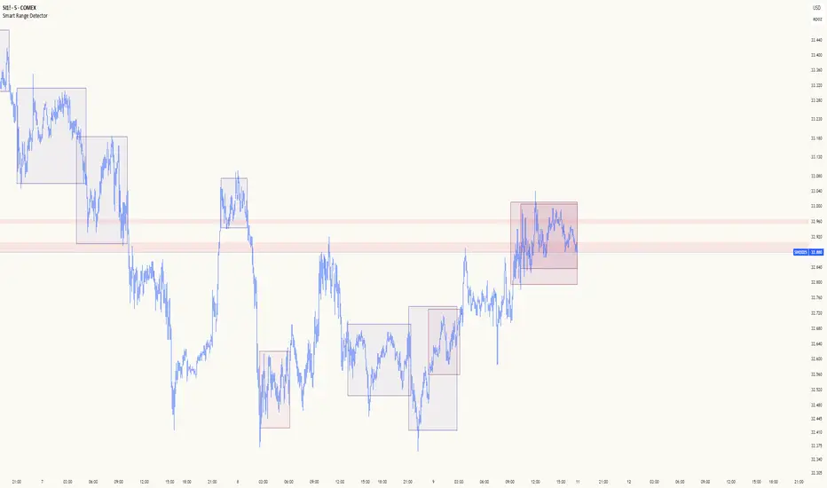
Smart Range DetectorSmart Range Detector
What It Does
This indicator automatically detects and validates significant trading ranges using pivot point analysis combined with logarithmic fibonacci relationships. It operates by identifying specific pivot patterns (High-Low-High and Low-High-Low) that meet fibonacci validation criteria to filter out noise and highlight only the most reliable trading ranges. Each range is continuously monitored for potential mitigation (breakout) events.
Key Features
Identifies both High-Low-High and Low-High-Low range patterns
Validates each range using logarithmic fibonacci relationships (more accurate than linear fibs)
Detects range mitigations (breakouts) and visually differentiates them
Shows fibonacci levels within ranges (25%, 50%, 75%) for potential reversal points
Visualizes extension levels beyond ranges for breakout targets
Analyzes volume profile with customizable price divisions (default: 60)
Displays Point of Control (POC) and Value Area for traded volume analysis
Implements performance optimization with configurable range limits
Includes user-adjustable safety checks to prevent Pine Script limitations
Offers fully customizable colors, line widths, and transparency settings
How To Use It
Identify Valid Ranges : The indicator automatically detects and highlights trading ranges that meet fibonacci validation criteria
Monitor Fibonacci Levels : Watch for price reactions at internal fib levels (25%, 50%, 75%) for potential reversal opportunities
Track Extension Targets : Use the extension lines as potential targets when price breaks out of a range
Analyze Volume Structure : Enable the volume profile mode to see where most volume was traded within mitigated ranges
Trade Range Boundaries : Look for reactions at range highs/lows combined with volume POC for higher probability entries
Manage Performance : Adjust the maximum displayed ranges and history bars settings for optimal chart performance
Settings Guide
Left/Right Bars Look Back : Controls how far back the indicator looks to identify pivot points (higher values find more ranges but may reduce sensitivity)
Max History Bars : Limits how far back in history the indicator will analyze (stays within Pine Script's 10,000 bar limitation)
Max Ranges to Display : Restricts the total number of ranges kept in memory for improved performance (1-50)
Volume Profile : When enabled, shows volume distribution analysis for mitigated ranges
Volume Profile Divisions : Controls the granularity of the volume analysis (higher values show more detail)
Display Options : Toggle visibility of range lines, fibonacci levels, extension lines, and volume analysis elements
Transparency & Color Settings : Fully customize the visual appearance of all indicator elements
Line Width Settings : Adjust the thickness of lines for better visibility on different timeframes
Technical Details
The indicator uses logarithmic fibonacci calculations for more accurate price relationships
Volume profile analysis creates 60 price divisions by default (adjustable) for detailed volume distribution
All timestamps are properly converted to work with Pine Script's bar limitations
Safety checks prevent "array index out of bounds" errors that plague many complex indicators
Time-based coordinates are used instead of bar indices to prevent "bar index too far" errors
This indicator works well on all timeframes and instruments, but performs best on 5-minute to daily charts. Perfect for swing traders, range traders, and breakout strategists.
What Makes It Different
Most range indicators simply draw boxes based on recent highs and lows. Smart Range Detector validates each potential range using proven fibonacci relationships to filter out noise. It then adds sophisticated volume analysis to help traders identify the most significant price levels within each range. The performance optimization features ensure smooth operation even on lower timeframes and extended history analysis.
Volume Zones Internal Visualizer [LuxAlgo]The Volume Zones Internal Visualizer is an alternate candle type intended to reveal lower timeframe volume activity while on a higher timeframe chart.
It displays the candle's range, the highest and lowest zones of accumulated volume throughout the candle, and the Lower Timeframe (LTF) candle close, which contained the most volume in the session (Candle Session).
🔶 USAGE
The indicator is intended to be used as its own independent candle type. It is not a replacement for traditional candlesticks; however, it is recommended that you hide the chart's display when using this indicator. Another option is to display this indicator in an additional pane alongside the normal chart, as displayed above.
The display consists of candle ranges represented by outlined boxes, within the ranges you will notice a transparent-colored zone, a solid-colored zone, and a line.
Each of these displays different points of volume-related information from an analysis of LTF data.
In addition to this analysis, the indicator also locates the LTF candle with the highest volume, and displays its close represented by the line. This line is considered as the "Peak Activity Level" (PAL), since throughout the (HTF) candle session, this candle's close is the outcome of the most volume transacted at the time.
We are further tracking these PALs by continuing to extend them into the future, looking towards them for potential further interaction. Once a PAL is crossed, we are removing it from display as it has been mitigated.
🔶 DETAILS
The indicator aggregates the volume data from each LTF candle and creates a volume profile from it; the number of rows in the profile is determined by the "Row Size" setting.
With this profile, it locates and displays the highest (solid area) and lowest (transparent area) volume zones from the profile created.
🔶 SETTINGS
Row Size: Sets the number of rows used for the calculation of the volume profile based on LTF data.
Intrabar Timeframe: Sets the Lower Timeframe to use for calculations.
Show Last Unmitigated PALs: Choose how many Unmitigated PALs to extend.
Style: Toggle on and off features, as well as adjust colors for each.
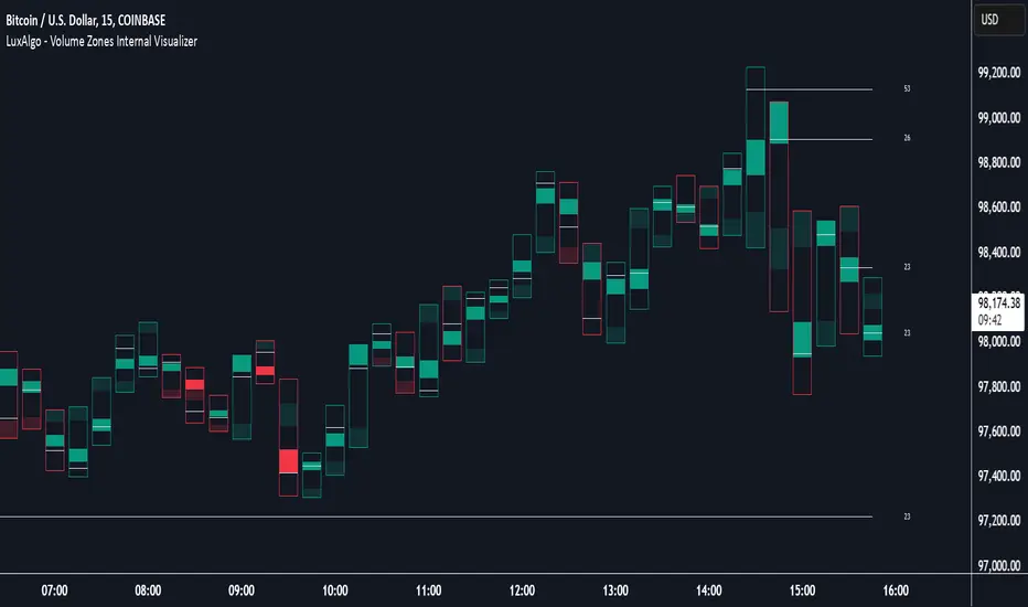
Volatility Footprint CandlesVolatility Footprint is an innovative volume profile indicator that dynamically adapts to real-time market conditions, providing traders with a powerful tool to visualize and interpret market structure, order flow, and potential areas of support and resistance.
At its core, Volatility Footprint combines the concepts of market profile, volume analysis, and volatility measurement to create a unique and adaptive charting experience. The indicator intelligently adjusts its display based on the current market volatility, ensuring that traders always have a clear and readable chart, regardless of the instrument or timeframe they are analyzing.
The footprint chart is composed of a series of color-coded boxes, each representing a specific price level. The color of the box indicates whether there is a net buying or selling pressure at that level, while the opacity reflects the relative strength of the volume. This intuitive visualization allows traders to quickly identify areas of high and low volume, as well as potential imbalances in order flow.
In addition to the individual box volumes, Volatility Footprint also calculates and displays the cumulative volume delta. This running total of buy and sell volumes across all price levels provides valuable insight into the overall market sentiment and potential trends.
One of the key features of Volatility Footprint is its ability to identify and highlight the Point of Control (POC). The POC represents the price level with the highest volume concentration and serves as a key reference point for potential support or resistance. By drawing attention to this crucial level, the indicator helps traders make more informed decisions about potential entry and exit points.
Volatility Footprint is designed to be highly customizable, allowing traders to tailor the appearance of the footprint chart to their specific preferences. Users can easily modify the colors, opacity, and size of the boxes, labels, and POC marker to enhance readability and clarity.
The indicator's versatility makes it suitable for a wide range of trading styles and strategies. Whether you are a scalper looking for short-term opportunities or a swing trader aiming to identify potential trend reversals, Volatility Footprint can provide valuable insights into market dynamics.
By combining Volatility Footprint with other forms of analysis, such as price action, key levels, and technical indicators, traders can gain a more comprehensive understanding of market behavior and make better-informed trading decisions.
Volatility Footprint's adaptive approach to volume profile analysis sets it apart from traditional fixed-resolution volume profile indicators. By dynamically adjusting to the unique characteristics of each instrument and timeframe, the indicator ensures that traders always have a clear and meaningful representation of market structure and order flow.
Volatility Footprint is a powerful tool that traders can incorporate into their market analysis and decision-making process. By providing a dynamic, visual representation of volume and order flow at different price levels, this indicator offers valuable insights into market structure, sentiment, and potential areas of support and resistance. Let's explore how traders might effectively utilize Volatility Footprint in their trading approach.
1. Identifying Key Levels:
One of the primary uses of Volatility Footprint is to identify key price levels where significant trading activity has occurred. The color-coded boxes allow traders to quickly spot areas of high volume concentration, which may indicate potential support or resistance zones. For example, if a trader notices a cluster of boxes with high opacity at a specific price level, they may interpret this as a strong support or resistance area, depending on the prevailing market context. By paying attention to these key levels, traders can make more informed decisions about potential entry and exit points, as well as placement of stop-loss orders and profit targets.
2. Assessing Market Sentiment:
The cumulative volume delta feature of Volatility Footprint provides traders with a valuable gauge of overall market sentiment. By analyzing the running total of buy and sell volumes across all price levels, traders can gain insight into the dominant market forces at play. If the cumulative delta is significantly positive, it may suggest a bullish sentiment, as buying pressure has been consistently outpacing selling pressure. Conversely, a negative cumulative delta may indicate a bearish sentiment. Traders can use this information to confirm or question their bias and adjust their trading plan accordingly.
3. Confirming Breakouts and Trend Reversals:
Volatility Footprint can be particularly useful in confirming the strength and validity of breakouts and potential trend reversals. When a price level is breached, traders can refer to the footprint chart to assess the volume and order flow characteristics around that level. If the breakout is accompanied by a surge in volume and a clear imbalance between buying and selling pressure, it may suggest a strong and sustainable move. On the other hand, if the volume is relatively low or evenly distributed, the breakout may be less reliable. By using Volatility Footprint to confirm breakouts, traders can make more informed decisions about whether to enter or exit a trade, or to adjust their position size.
4. Detecting Imbalances and Potential Reversals:
Imbalances between buying and selling pressure at specific price levels can often precede significant market moves or reversals. Volatility Footprint makes it easy for traders to spot these imbalances visually. For instance, if a trader observes a price level with a significantly larger number of sell boxes compared to buy boxes, it may indicate a potential exhaustion point for a bullish trend, and a reversal might be imminent. Traders can use this information in conjunction with other technical analysis tools, such as trendlines, moving averages, or momentum oscillators, to identify high-probability trading opportunities.
5. Adapting to Market Conditions:
One of the key strengths of Volatility Footprint is its ability to dynamically adapt to the unique volatility characteristics of different instruments and timeframes. This adaptability ensures that the indicator remains relevant and informative across a wide range of market conditions. Traders can use Volatility Footprint to gauge the relative volatility and volume of a particular instrument or timeframe, and adjust their trading approach accordingly. For example, in a highly volatile market, traders may opt for wider stop-loss levels and smaller position sizes to account for the increased risk.
Incorporating Volatility Footprint into a trading strategy requires a combination of technical analysis, market understanding, and risk management. Traders should use this indicator as part of a comprehensive approach, combining it with other forms of analysis, such as price action, key levels, and technical indicators. By doing so, traders can gain a more complete picture of market dynamics and make better-informed trading decisions.
It's important to note that while Volatility Footprint provides valuable insights, it should not be relied upon as a standalone trading signal. Traders should always consider the broader market context, their risk tolerance, and their overall trading plan when making decisions based on the information provided by this indicator.
In conclusion, Volatility Footprint offers traders a dynamic and visually intuitive way to analyze market structure, volume, and order flow. By identifying key levels, assessing market sentiment, confirming breakouts, detecting imbalances, and adapting to market conditions, traders can leverage this powerful tool to make more informed and confident trading decisions. As with any technical analysis tool, Volatility Footprint should be used in conjunction with sound risk management principles and a well-defined trading strategy to maximize its effectiveness.

Key Levels Suite - By LeviathanThis is a comprehensive script, designed to display over 100 key price levels across multiple dimensions, including volume profile levels, HTF levels, VWAPs, SMAs/EMAs, market session levels, day of week levels and more. The indicator offers high flexibility in features, settings and visual appearance.
● The script organizes levels into six main categories:
Higher Timeframe (HTF) Levels
- Current and/or previous period: Open, High, Low, and Midpoint for Daily, Weekly, Monthly, Quarterly, and Yearly timeframes (eg. levels for current weekly high/low and previous weekly high/low).
- These levels provide a clear structure for identifying key support and resistance zones. Traders often use HTF levels to anticipate price reactions, such as bounces or rejections, at major highs and lows. For example, a price nearing the weekly high could signal an area of resistance.
VWAP Levels
- Current and/or previous period: VWAP and upper/lower standard deviations for Daily, Weekly, Monthly, Quarterly, and Yearly timeframes (eg. levels for current daily VWAP and previous weekly VWAP).
- VWAP levels give traders insight into whether the current price is above or below the fair market value for a given period. It’s often used as a reference point for trend direction or S/R. If the price remains above VWAP, the trend may be seen as bullish, while breaks below VWAP can suggest a shift toward bearish sentiment. Standard deviations help identify areas where the price may be overextended, offering opportunities for mean reversion trades.
Moving Average Levels
- EMA and SMA for three customizable lengths (eg. levels for 200 EMA, 50 EMA and 100 SMA).
- These levels act as dynamic support and resistance lines that adjust with price movement. Traders use them to confirm trend direction and watch for reactions around these levels, particularly in trending markets. For example, when the price pulls back to a 200 EMA, it could present an opportunity to enter a trade in line with the prevailing trend.
Volume Profile Levels
- Current and previous: Point of Control (POC), Value Area High (VAH), and Value Area Low (VAL) for Daily, Weekly, Monthly, Quarterly, and Yearly timeframes (eg. levels for current day POC and previous day POC).
- Volume Profile levels highlight price areas where significant trading occurred. The POC indicates the price where the most volume was traded and can act as a strong magnet for price. VAH and VAL mark the boundaries of value areas, making them excellent spots for breakout or mean reversion trades. Traders look for price reactions around these zones to either join or fade moves.
Market Session Levels
- Current and previous: Open, high, low, and midpoint for three user-defined sessions, with default being Tokyo, London, and New York (eg. levels for current New York session open and previous New York session high and low).
- Session levels allow traders to track how price behaves across different global market sessions. For instance, the New York open often brings increased liquidity and volatility. Traders often use these levels to anticipate sharp moves or continuations, especially after session highs and lows are broken, signaling shifts in market momentum.
Day of Week Levels
- Open, high, low, and midpoint for Monday through Sunday (eg. levels for Monday's high and low and Tuesday open).
- These levels help traders identify recurring intraday or intraweek price behaviors. For example, highs or lows established earlier in the week can serve as benchmarks for breakouts or retracements later on. Monday’s open or Friday’s high/low often reflect market sentiment going into or out of the weekend, providing valuable clues for planning trades.
● About the script
I published this script because it was heavily requested by my Tradingview followers who wanted a clean and feature-rich indicator that can display various levels they use in their analysis. The indicator can display levels that are not available in other similar public scripts and makes sure to calculate and load calculation-intensive levels (like volume profile levels, higher timeframe vwap levels, etc) as fast and efficiently as possible. It is one of the only scripts I've published that is not open source. The code is protected because it includes some proprietary calculations (eg: for POC/VAH/VAL), that I don't wish to open source, but I still want to publish a heavily requested script in a public and free format.
● How to use the script
1. Add the script to your chart
Start by adding the script to your chart like any other indicator.
2. Open the indicator settings
Click the settings icon to access all customization options.
3. Select which level groups to display
In the "Controls" section, choose which groups of levels (HTF, VWAP, Moving Averages, etc.) you want displayed. This allows you to quickly toggle between different sets of levels depending on your analysis needs, without overcrowding the chart.
4. Adjust group-specific settings
Scroll down to access detailed settings for each group. For any group, you can choose:
- The relevant time parameter (e.g., Daily, Weekly, Monthly, etc for HTF/VWAP/Volume Profile levels, length for Moving Average levels, day for Day of Week Levels, etc).
- Specific levels to display (e.g., Open/High/Low/Midpoint for HTF, VWAP, Day of Week, Session levels and POC/VAH/VAL for Volume Profile levels).
- For applicable groups, you can also toggle previous period levels by selecting them from the row starting with the "↳" icon.
5. Customize visual appearance
In the "Appearance" section, you have full control over how the levels and labels look. You can:
- Choose what details appear in the labels (e.g., level name, price, or percentage distance from current price).
- Pick from different line types, line style (solid, dashed, dotted), adjust line width, and manage the length of the lines using "Offset Right" and "Offset Left" settings.
- Modify font, label size, and color options. If multiple levels overlap at the same price, use the “Merge Levels” option to combine them into one, reducing visual clutter.
6. Customize level names to your preference
In the "Labels" section, you can rename any parameter to match your preferred abbreviations (e.g., change “Weekly Open” to “wO” or any other shorthand that works for you).
● Key Features:
- Display various different important levels, all in one indicator
- Seamless control of which group of levels / specific level to display
- Choose from various line and label styles to display levels.
- Labels can show the level's title (customizable abbreviations), price, and percentage distance from the current price.
- Merge nearby levels to reduce chart clutter, either for identical levels or those within a user-defined percentage range.
- Fully customizable visual appearance of levels to suit individual preferences.
CRT Market Structure Toolkit v4 ALEXCRT Market Structure Toolkit v4 — Developer Overview
CRT Market Structure Toolkit v4 is a public, protected TradingView indicator designed for discretionary traders who focus on market structure, liquidity, session behavior, and higher-timeframe (HTF) context.
The script combines multiple widely known institutional trading concepts into a single, highly configurable overlay.
It is intended to provide context and structural insight, not automated trading signals.
All logic is implemented in a protected format to prevent source-code access, while remaining fully usable as a public analysis tool.
Core Features
1. Previous Day High / Low (PDH / PDL) — Original Logic
Full 24-hour New York session tracking.
Dynamically records the true daily high and low.
Levels extend in real time until a liquidity sweep occurs.
Once swept:
Line style switches to dashed.
Level freezes permanently.
Optional clean labels that follow price until mitigation.
Configurable history depth.
PDH / PDL calculation, sweep detection, level freezing, and labeling behavior are original implementations.
2. HTF High / Low Sweep Levels — Original Logic
Tracks High / Low of any user-defined higher timeframe (default: 4H).
Levels extend forward and freeze after being swept.
Optional dynamically positioned labels.
Independent history controls.
HTF sweep logic and level lifecycle management are original to this script.
3. Fair Value Gaps (FVG) & Balanced Price Range (BPR)
Detection of bullish and bearish Fair Value Gaps using classic three-candle displacement logic.
Configurable filters:
Lookback window
Minimum gap size
Mitigation models (full, partial, or none)
Automatically highlights the nearest active FVG relative to price.
Marks Balanced Price Ranges (BPR) where bullish and bearish gaps overlap.
Credits / Inspiration
Fair Value Gap (FVG) and Balanced Price Range (BPR) concepts commonly used in institutional and ICT-style market structure methodologies.
4. Killzones (Sessions)
Time-based session boxes with dynamic high/low expansion.
Custom session times and colors.
Designed to integrate cleanly with PDH and HTF levels.
Credits / Inspiration
Killzone session concepts (Asia, London, New York).
5. Multi-Session Framework & Volume Profile
Up to six configurable global trading sessions.
Each session supports:
Visual box / area / line rendering
Session high and low
Optional Volume Profile
Volume Profile includes:
Point of Control (POC)
Value Area High / Low (VAH / VAL)
Low Volume Nodes (LVN)
Optional session status table (open / closed).
Credits / Inspiration
Session profiling and Market Profile / Volume Profile theory.
6. Auto Fibonacci Retracement
Automatic Fibonacci projection based on ZigZag pivots.
Dynamic deviation using ATR.
Supports extensions, custom levels, labels, and background fills.
Credits
Uses TradingView’s official ZigZag library (TradingView/ZigZag).
7. Opening Gaps (NWOG / NDOG)
New Week Opening Gap (NWOG)
New Day Opening Gap (NDOG)
Optional Consequent Encroachment (CE) and midpoint logic.
Historical gap management with cleanup routines.
Credits
Opening gap and consequent encroachment concepts used in institutional price delivery models.
8. HTF Candle Overlay (Advanced)
Higher timeframe candle reconstruction on lower timeframe charts.
Supports:
Multiple HTFs
Liquidity sweeps
Midpoints
FVGs and volume imbalances
HTF timers and bias filtering
Credits / Inspiration
Higher timeframe candle overlay and liquidity-based market structure methodologies.
9. SMT Divergence
Detection of Smart Money Technique (SMT) divergence between correlated instruments.
Pivot-based relative strength and weakness comparison.
Visual marking of bullish and bearish SMT conditions.
Credits
SMT divergence concept (inter-market analysis).
Design Philosophy
No trade signals.
No execution automation.
No repainting logic for decision levels.
State-aware drawings with controlled lifecycle management.
Built for discretionary traders prioritizing:
Market structure
Liquidity behavior
Higher timeframe bias
Session context
Usage, Visibility & Protection
Data Source & Instrument Note
Higher timeframe ranges (such as 4H highs and lows) may differ between futures and CFD instruments due to differences in data sources, session times, and candle construction.
This indicator calculates all levels based strictly on the selected symbol and its native data feed.
Users should be aware that HTF ranges and sweep behavior may not align perfectly across different instrument types, even when tracking the same underlying market.
This indicator is published as Public with Protected source code.
The script is fully usable by the public on TradingView charts.
Source code access, copying, modification, or derivative redistribution is not permitted.
The script is provided for personal, educational, and analytical use only.
It is not intended for commercial redistribution, resale, or inclusion in paid products or services.
Intellectual Property & Credits
PDH / PDL and HTF sweep systems are original implementations owned by the author.
Other components represent integrations or adaptations of publicly known trading concepts, credited at a conceptual level.
The script is built using original code and publicly documented methodologies only.
It does not contain or reuse any private, paid, or proprietary indicators or scripts.
Disclaimer
This script does not constitute financial advice and does not provide trade signals.
Trading involves risk. Users are solely responsible for their trading decisions and risk management.
Best settings for personal use :
imgur.com

LakyFx VWAP EMA RSI MFI (Multi-Ex Vol)Overview
LakyFx VWAP EMA RSI (Multi-Exchange Volume) is a clean, all-in-one overlay for trend context + mean-reversion levels + confirmed reversal signals. It combines VWAP bands, an EMA ribbon, RSI & MFI divergence markers, liquidity sweep signals, a session Volume Profile, HTF Key Levels — and a compact Ichimoku Cloud trend-state table (no cloud plotted) for quick regime filtering.
MFI can use Multi-Exchange Volume (spot + perp, auto-mapped per ticker) to make volume-aware signals more robust on crypto.
Key Features
VWAP + Bands (multi-anchor VWAP context with optional bands for dynamic support/resistance & mean-reversion zones)
EMA Ribbon (6x) for structure + confluence with VWAP/levels
PVSRA Candles (volume-tier candle coloring for participation/intensity)
Session Volume Profile (VRVP-like session profile modes)
Key Levels (HTF) : Daily Open, Monday Range (High/Low + optional Mid), Weekly Open (+ optional prev High/Low/Mid), Monthly Open (+ optional prev High/Low/Mid), Yearly Open (+ optional current High/Low/Mid)
Signals & Markers : rejection + volume climax, liquidity sweeps, RSI divergence (diamonds), MFI divergence (squares)
Ichimoku Cloud Status (Table) : 7-state trend classification (Strong Bull / Bull / Bullish Early / Neutral / Bearish Early / Bear / Strong Bear) without drawing the cloud
Legend (Table) explaining on-chart symbols
Multi-Exchange Volume (for MFI)
On crypto, MFI can aggregate volume from up to 10 markets (spot + perp across major exchanges) and automatically adapts when you switch tickers. A small table can show how many sources are currently active (e.g., 9/10) so you can verify data availability.
Alerts (confirmed bar close)
Alert triggers are available for the main on-chart symbols (e.g., triangles/circles/diamonds/squares, liquidity sweeps). Alerts are designed to trigger on confirmed bars (bar close) to reduce false notifications.
How to use (quick guide)
Use VWAP + EMA as your map: trend bias, pullbacks, and mean-reversion zones.
Treat RSI/MFI divergences as timing tools — strongest near VWAP bands, EMA confluence, and Key Levels.
Use Ichimoku Cloud status as a regime filter (trend vs neutral/chop) without cluttering the chart.
Keywords : VWAP, VWAP Bands, EMA Ribbon, RSI Divergence, MFI Divergence, Multi-Exchange Volume, Liquidity Sweep, PVSRA, Volume Profile, Key Levels, Ichimoku Cloud.
Disclaimer
This indicator is for educational/analytical purposes only and is not financial advice. Always manage risk.

BK AK-Ghost Ladder⚔️ BK AK–Ghost Ladder — FVG Zones + Scoring + POC + Role Flip ⚔️
Update / Record
A previous version of this publication was hidden due to insufficient description. This republish is a complete, self-contained explanation of what the script does, how it works, and how to use it.
What this indicator does
Ghost Ladder detects Fair Value Gaps (FVGs), tracks them as living support/resistance zones, and adds context so you can prioritize which zones matter most right now (strength rating, confluence, volume profile/POC, breaks, and role flips).
How zones are detected (FVG rule)
Ghost Ladder uses a clean 3-bar gap definition with a size filter:
Bullish FVG when low > high and the gap size exceeds your ATR / % threshold.
Bearish FVG when high < low and the gap size exceeds your ATR / % threshold.
It also supports timeframe-adaptive filters (different distance thresholds for <1H vs ≥1H).
Zone lifecycle (how it manages them)
Each zone is managed over time with controls for:
Expiration (max age) + optional reset age on touch
Overlap / proximity logic (prevent overlap, keep strongest near duplicates)
Distance filters (hide zones too far from current price)
Optional smart positioning: show all / hide wrong-side / auto role flip
Strength score (0–100) + star rating
Every zone receives a score based on measurable factors (not a prediction). Key contributors include:
Relative volume vs average (optionally using lower-TF volume aggregation)
Gap size vs ATR
Pivot confluence + MTF confluence (optional)
Session weighting (Asia/London/NY/Overlap)
Optional extras: VWAP proximity, order block overlap, imbalance, fib alignment, clustering, and delta divergence flags
The ★ rating is derived directly from the numeric score thresholds you set.
In-zone Volume Profile + POC
If enabled, the script builds a lower-timeframe volume profile inside each zone using bins:
POC line (highest-volume price area within the zone)
Optional volume sum
Optional delta-style display based on relative bull/bear volume inside the zone
Breaks, broken zones, and role reversal
Zones can be marked broken when price violates the zone boundary using:
Break confirmation bars
Optional body-only break requirement
After a break, Ghost Ladder can track role reversal (support ↔ resistance) with confirmation touches.
Divergence / alerts (decision assistance)
Optional real-time divergence checks when price is interacting with a zone:
RSI divergence, OBV divergence, and weak ADX condition (configurable)
Alerts include:
Strong FVG events
Divergence at zone touch
Magnetic pull proximity (optional)
How to use (simple workflow)
Start with default filters on your main timeframe.
Use min star rating to cut weak zones.
Execute at zone edges, not mid-zone.
Treat broken + confirmed role flip as higher priority than fresh untested gaps.
Use POC + volume balance inside the zone to judge whether it’s being defended or vacated.
If divergence fires at the boundary, treat it as a risk flag (wait for confirmation or reduce size).
What makes it original
This tool is not “just boxes”: it integrates zone lifecycle management + scoring + in-zone profile/POC + break/role logic into one coherent decision framework with configurable filters, rather than standalone drawings.
🙏 Respect + Seal
All glory to G-d — the true source of wisdom and endurance.
Respect to AK — discipline, patience, and clarity.
📜 Solomon’s Boundary
“Do not remove the ancient boundary stone.” Ghost Ladder is built to mark boundaries that price must respect, break, or reclaim.
⚔️ BK AK-Ghost Ladder — Map the rungs. Respect the boundary. Execute with discipline.
May Gd bless your vision, your patience, and every decision you make at the edge. 🙏

Smart Money Flow Cloud [BOSWaves]Smart Money Flow Cloud - Volume-Weighted Trend Detection with Adaptive Volatility Bands
Overview
Smart Money Flow Cloud is a volume flow-aware trend detection system that identifies directional market regimes through money flow analysis, constructing adaptive volatility bands that expand and contract based on institutional pressure intensity.
Instead of relying on traditional moving average crossovers or fixed-width channels, trend direction, band width, and signal generation are determined through volume-weighted money flow calculation, nonlinear flow strength modulation, and volatility-adaptive band construction.
This creates dynamic trend boundaries that reflect actual institutional buying and selling pressure rather than price momentum alone - tightening during periods of weak flow conviction, expanding during strong directional moves, and incorporating flow strength statistics to reveal whether regimes formed under accumulation or distribution conditions.
Price is therefore evaluated relative to adaptive bands anchored at a flow-informed baseline rather than conventional trend-following indicators.
Conceptual Framework
Smart Money Flow Cloud is founded on the principle that sustainable trends emerge where volume-weighted money flow confirms directional price movement rather than where price alone creates patterns.
Traditional trend indicators identify regime changes through price crossovers or slope analysis, which often ignore the underlying volume dynamics that validate or contradict those movements.This framework replaces price-centric logic with flow-driven regime detection informed by actual buying and selling volume.
Three core principles guide the design:
Trend direction should correspond to volume-weighted flow dominance, not price movement alone.
Band width must adapt dynamically to current flow strength and volatility conditions.
Flow intensity context reveals whether regimes formed under conviction or uncertainty.
This shifts trend analysis from static moving averages into adaptive, flow-anchored regime boundaries.
Theoretical Foundation
The indicator combines adaptive baseline smoothing, close location value (CLV) methodology, volume-weighted flow tracking, and nonlinear strength amplification.
A smoothed trend baseline (EMA or ALMA) establishes the core directional reference, while close location value measures where price settled within each bar's range. Volume weighting applies directional magnitude to flow calculation, which accumulates into a normalized money flow ratio. Flow strength undergoes nonlinear power transformation to amplify strong conviction periods and dampen weak flow environments. Average True Range (ATR) provides volatility-responsive band sizing, with final width determined by the interaction between base volatility and flow-modulated multipliers.
Four internal systems operate in tandem:
Adaptive Baseline Engine : Computes smoothed trend reference using either EMA or ALMA methodology with configurable secondary smoothing.
Money Flow Calculation System : Measures volume-weighted directional pressure through CLV analysis and ratio normalization.
Nonlinear Flow Strength Modulation : Applies power transformation to flow intensity, creating dynamic sensitivity scaling.
Volatility-Adaptive Band Construction : Scales band width using ATR measurement combined with flow-strength multipliers that range from minimum (calm) to maximum (strong flow) expansion.
This design allows bands to reflect actual institutional behavior rather than reacting mechanically to price volatility alone.
How It Works
Smart Money Flow Cloud evaluates price through a sequence of flow-aware processes:
Close Location Value (CLV) Calculation : Each bar's closing position within its high-low range is measured, creating a directional bias indicator ranging from -1 (closed at low) to +1 (closed at high).
Volume-Weighted Flow Tracking : CLV is multiplied by bar volume, then accumulated and normalized over a configurable flow window to produce a money flow ratio between -1 and +1.
Flow Smoothing and Strength Extraction : The raw money flow ratio undergoes optional smoothing, then nonlinear power transformation to amplify strong flow periods and compress weak flow environments.
Adaptive Baseline Construction : Price (both open and close) is smoothed using either EMA or ALMA methodology with optional secondary smoothing to create a stable trend reference.
Dynamic Band Sizing : ATR measurement is multiplied by a flow-strength-modulated factor that interpolates between minimum (tight) and maximum (wide) multipliers based on current flow conviction.
Regime Detection and Visualization : Price crossing above the upper band triggers bullish regime, crossing below the lower band triggers bearish regime. The baseline cloud visualizes open-close relationship within the current trend.
Retest Signal Generation : Price touching the baseline from within an established regime generates retest signals with configurable cooldown periods to prevent noise.
Together, these elements form a continuously updating trend framework anchored in volume flow reality.
Interpretation
Smart Money Flow Cloud should be interpreted as flow-confirmed trend boundaries:
Bullish Regime (Blue) : Activated when price crosses above the upper adaptive band, indicating volume-confirmed buying pressure exceeding volatility-adjusted resistance.
Bearish Regime (Red) : Established when price crosses below the lower adaptive band, identifying volume-confirmed selling pressure breaking volatility-adjusted support.
Baseline Cloud : The gap between smoothed open and smoothed close within the baseline visualizes intrabar directional bias - wider clouds indicate stronger intrabar momentum.
Adaptive Band Width : Reflects combined volatility and flow strength - wider bands during high-conviction institutional activity, tighter bands during consolidation or weak flow periods.
Buy/Sell Labels : Appear at regime switches when price crosses from one band to the other, marking potential trend inception points.
Retest Signals (✦) : Diamond markers indicate price touching the baseline within an established regime, often occurring during healthy pullbacks in trending markets.
Trend Strength Gauge : Visual meter displays current regime strength as a percentage, calculated from price position within the active band relative to baseline.
Background Gradient : Optional coloring intensity reflects flow strength magnitude, darkening during high-conviction periods.
Flow strength, band width adaptation, and baseline relationship outweigh isolated price fluctuations.
Signal Logic & Visual Cues
Smart Money Flow Cloud presents three primary interaction signals:
Regime Switch - Buy : Blue "Buy" label appears when price crosses above the upper band after previously being in a bearish regime, suggesting volume-confirmed bullish transition.
Regime Switch - Sell : Red "Sell" label displays when price crosses below the lower band after previously being in a bullish regime, indicating volume-confirmed bearish transition.
Trend Retest : Diamond (✦) markers appear when price touches the baseline within an established regime, with configurable cooldown periods to filter noise.
Alert generation covers regime switches and retest events for systematic monitoring.
Strategy Integration
Smart Money Flow Cloud fits within volume-informed and institutional flow trading approaches:
Flow-Confirmed Entry : Use regime switches as primary trend inception signals where volume validates directional breakouts.
Retest-Based Refinement : Enter on baseline retest signals within established regimes for improved risk-reward positioning during pullbacks.
Band Width Context : Expect wider price swings when bands expand (high flow strength), tighter ranges when bands contract (weak flow).
Baseline Cloud Confirmation : Favor trades where baseline cloud width confirms intrabar momentum alignment with regime direction.
Strength Gauge Filtering : Use trend strength percentage to gauge continuation probability - higher readings suggest stronger institutional conviction.
Multi-Timeframe Regime Alignment : Apply higher-timeframe regime context to filter lower-timeframe entries, taking only setups aligned with dominant flow direction.
Technical Implementation Details
Core Engine : Configurable EMA or ALMA baseline with secondary smoothing
Flow Model : Close Location Value (CLV) with volume weighting and ratio normalization
Strength Transformation : Configurable power function for nonlinear flow amplification
Band Construction : ATR-scaled width with flow-strength-interpolated multipliers
Visualization : Dual-line baseline cloud with gradient fills, regime-colored bands, and embedded strength gauge
Signal Logic : Band crossover detection with baseline retest identification and cooldown management
Performance Profile : Optimized for real-time execution with minimal computational overhead
Optimal Application Parameters
Timeframe Guidance:
1 - 5 min : Micro-structure regime detection for scalping and intraday reversals
15 - 60 min : Intraday trend identification with flow-validated swings
4H - Daily : Swing and position-level regime analysis with institutional flow context
Suggested Baseline Configuration:
Trend Length : 34
Trend Engine : EMA
Trend Smoothing : 3
Flow Window : 24
Flow Smoothing : 5
Flow Boost : 1.2
ATR Length : 14
Band Tightness (Calm) : 0.9
Band Expansion (Strong Flow) : 2.2
Reset Cooldown : 12
These suggested parameters should be used as a baseline; their effectiveness depends on the asset's volume profile, volatility characteristics, and preferred signal frequency, so fine-tuning is expected for optimal performance.
Parameter Calibration Notes
Use the following adjustments to refine behavior without altering the core logic:
Bands too wide/frequent whipsaws : Reduce "Band Expansion (Strong Flow)" to limit maximum band width, or increase "Band Tightness (Calm)" to widen minimum bands and reduce noise sensitivity.
Trend baseline too choppy : Increase "Trend Length" for smoother baseline, or increase "Trend Smoothing" for additional filtering.
Flow readings unstable : Increase "Flow Smoothing" to reduce bar-to-bar noise in money flow calculation.
Missing legitimate regime changes : Decrease "Trend Length" for faster baseline response, or reduce "Band Tightness (Calm)" for earlier breakout detection.
Too many retest signals : Increase "Reset Cooldown" to space out retest markers, or disable retest signals entirely if not using pullback entries.
Flow strength not responding : Increase "Flow Boost" (power factor) to amplify strong flow differentiation, or decrease "Flow Window" to emphasize recent volume activity.
Prefer different smoothing characteristics : Switch "Trend Engine" to ALMA and adjust "ALMA Offset" (higher = more recent weighting) and "ALMA Sigma" (higher = smoother) for alternative baseline behavior.
Adjustments should be incremental and evaluated across multiple session types rather than isolated market conditions.
Performance Characteristics
High Effectiveness:
Markets with consistent volume participation and institutional flow
Instruments where volume accurately reflects true liquidity and conviction
Trending environments where flow confirms directional price movement
Mean-reversion strategies using retest signals within established regimes
Reduced Effectiveness:
Extremely low volume environments where flow calculations become unreliable
News-driven or gapped markets with discontinuous volume patterns
Highly manipulated or thinly traded instruments with erratic volume distribution
Ranging markets where price oscillates within bands without conviction
Integration Guidelines
Confluence : Combine with BOSWaves structure, order flow analysis, or traditional volume profile
Flow Validation : Trust regime switches accompanied by strong flow readings and wide band expansion
Context Awareness : Consider whether current market regime matches historical flow patterns
Retest Discipline : Use baseline retest signals as confirmation within trends, not standalone entries
Breach Management : Exit regime-aligned positions when price crosses opposing band with volume confirmation
Disclaimer
Smart Money Flow Cloud is a professional-grade volume flow and trend analysis tool. Results depend on market conditions, volume reliability, parameter selection, and disciplined execution. BOSWaves recommends deploying this indicator within a broader analytical framework that incorporates price structure, market context, and comprehensive risk management.
